Showing posts with label nolzur's marvelous miniatures. Show all posts

Sunday, June 30, 2019

Githyanki: Best Fiend

In September 1983, a thirteen-year-old version of myself was staring at a ditto sheet entitled, "Name three (3) books you read during the summer".  It happened to be a summer I didn't read very much, which was unusual for me.  My mother kept yelling at me to read "A Light in the Forest". I struggled with the pacing and daydreamed too often.  Eventually I wrote down:
  • A Light in the Forest 
  • Johnathan Livingston Seagull
  • Fiend Folio (Dungeons and Dragons)
The hours mulling over the creatures in the book is probably what fueled all my daydreams.  Needleman and slaad. Penanggalan and forlarren.  Eye of Fear and Flame.  One entry rebirthed my childhood fascination with scarecrows.  I remember dreaming about whether one could play out an encounter with a revenant just like the splash page.

Not all were great.  The triapheg looked like a couple melted mannequins repurposed for a low-budget sci-fi film. When I saw Wes Craven's Shocker, I thought, "This movie is so bad, it actually makes the old monster look frightening."  And the adherer ranks among some of D&D's goofier creations (although they got a fantastic new coat of paint in Misfit Monsters Revisited and got a lot of love from me.)

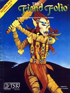
But the best fiend of the folio was posted on the cover - the githyanki.
   Survivors of a long enslavement, descendents of a rebel, now living in the Astral Plane, as ruthless pillagers with silver swords.

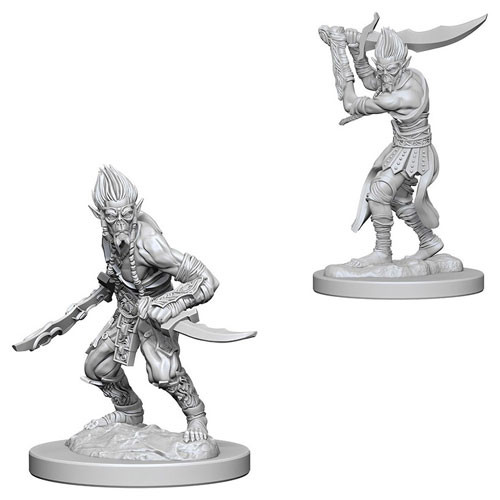
So my old college roommate surprised me by announcing he was playing D&D again and convinced his DM to play a githyanki.   Immediately shuffling through my mini shopping sites, I found a pair of Nolzur's Marvelous Unpainted Miniatures githyanki.  

I wanted to recreate the classic Fiend Folio cover, though admittedly the color palette needed a little updating. I'm not going to have a lush blue background so all those yellow-browns, brownish-yellows and gold colors are going to look flat.

Leafing through google, I found some great updated reference pics: 
  • the one I remember fondly from 3E by Sam Wood
  • one by Wayne A. Reynolds - though his colors are overlit by a blue light source 
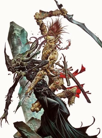
  • this personal fave by Wayne A. Reynolds - where a githyanki is in full swing, dicing up a mind flayer 
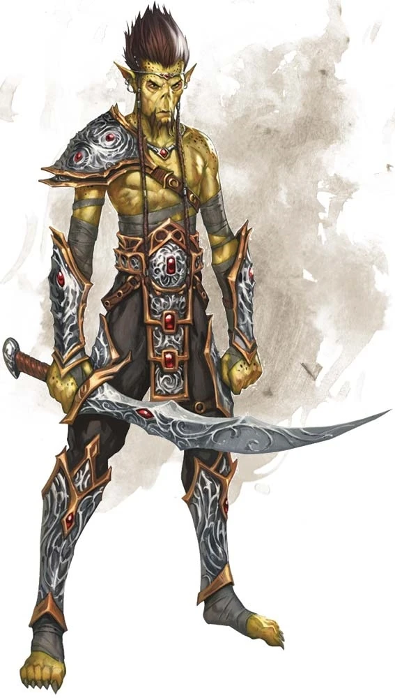
  • but probably the best reference for this figure is this one from the 5E manual

Githyanki Color Scheme
  • Face and Skin - Base: Vallejo Khaki then a glaze of FolkArt Teddy Bear Tan, Shadow (Wash): FolkArt Ochre Yellow, Highlight: FolkArt Buttercup, Undershadow: Reaper Tanned Highlight, Deep Shadow: Mix of Reaper Ghoul Skin and Tanned Highlight
  • Wraps - Base: Reaper Ashen Brown, Wash: FolkArt Walnut Brown, Highlight: Reaper Dusky Skin Highlight
  • Bracer straps and defensive skirt - Base: Delta Ceramcoat Cinnamon, Wash: Reaper Dark Highlight
  • Straps - Base: Reaper HD Golden Brown, Wash: Reaper Dark Highlight, Highlight: FolkArt English Mustard
  • Eyes - Base: FolkArt Autumn Leaves with Mix of Autumn Leaves and Antique White in middle
  • Hair - Base: Delta Ceramcoat Cinnamon, Wash: Reaper Dark Highlight
  • Lioncloth - Base: Delta Ceramcoat Cinnamon, Wash: Mix of Reaper Dark Shadow and Cinnamon, Highlight 2: FolkArt Autumn Leaves
Githyanki Base Color Scheme
  • Rocky texture - Base: Reaper HD Ash Grey, Shadow (Wash): Reaper HD Solid Blue, Highlight: Mix of Reaper HD Ash Grey and Misty Grey, Undershadow: Reaper HD Military Grey, Final Glaze: Mix of Reaper HD Ash Grey
Plastic minis always come with an annoying amount of flash.  I've noted where bits needed filing or cutting on the forearms and the arms...

...on the arm straps, the loincloth, the wrappings on the legs...

...on the hands and sword handle...

  ...and under the arms.


Black Wash, work on the eye. Very happy with the squint in the left eye, but the right eye was too blotted out with the black color.  At the time, I thought I would be okay with it.  I wasn't. 


First pass on skin color.  Embarrassed to say I can't remember exactly what color I used here. Either it was a Vallejo Khaki or FolkArt Teddy Bear Tan.  I would revisit that right eye (stage left) later.

As I started filling in my first coat, I found some gaps in my palette plan, specifically on the wraps around the legs and arms. 

  • The belt would look best in gold and browns.  But I had to be careful not to overuse those colors against a yellow skin.  
  • Other browns would be needed to help separate the NMM golds.  
  • Reds and reddish browns had been taken by the loincloth, hair, and the defensive leather skirt (which to borrow a term from the Romans is called a "pteruges").  One other minor challenge: the githyanki on the old FF cover didn't have the leather pteruges (or definitive legs for that matter).

So with a palette drowning in yellows, browns and reds - another color was needed for the wraps. So it needed to be a dull color that wouldn't confuse the palette.  Reaper's HD Ashen Brown - with its muted purplish beige - came to the rescue.

Cinnamon and brown wash to get that reddish brown leather look on the pteruges and bracer straps.

While hard to see below, I fixed the right eye. That done, it was onto practicing my NMM abilities on the sword.  With a base coat of Reaper HD Armor Grey, I had to consider colors for the githyanki's legendary silver swords.  I considered a sterling silver look, but opted to emphasize the peaks similar to the edge at the base of this sword. 

First pass on sword.  The back of sword is correct but the front lines were all wrong.    


Starting over again on the front of sword with a solid base coat of Vallejo Cold Grey.  

Also, the mold defects began to show its faults on the front bracer. It lacked detail and the layers were more lumpy.  So normal NMM painting techniques - feathering glazes toward edges and applying washes to the recesses edges - don't work.  This would have to be manually fixed later on.


Some gemwork.  Cool blue as an accent helped give it a little pop.


Finally fixed front bracer and front of sword.


So a quick note on the smirk.  I was painting a thin black line between the lips for a little separation.  Unfortunately, I ended up giving him a happy smile.  Correction required adding more of the yellow flesh color, which needed several passes since black-on-yellow mistakes need multiple coats of yellow to hide.  You can see the results on the left - a serious expression with a squint to consider where to put the blade.

In the final stages, I was adding a thin glaze of FolkArt Buttercup to the lip area.  When I was done he got a bit of the smile back.  But this time it was a small smirk. 

These are the moments I love in the creative process.  I didn't plan on that smirk - I was actively avoiding it.  But sometimes the piece tells you what it wants. 


Now - time for the base.  Evoking the otherworldly Astral Plane feel from the old 1982 Fiend Folio meant imitating the blue background on the base itself.  

Some small wisps like what I did with the Widow Weaver would also be key in creating that extra-planar feel.  But I had to ship this to Germany... and I knew from experience cotton/PVA would get re-shaped in shipment.  It would be best to have the wisps of mist removable.

That meant - magnets again!  First step, I drilled some holes first.


Next I filled the holes in with green stuff and let it cure overnight.  Next day I put some saran wrap around the figure.  I put some pins on the magnet areas (below).  Finally I would mold green stuff over the pins.  That way the "bits" holding the wisps would retain the shape of the base.

Next was to paint the base and bits in the greys and blues listed above.  Then glue on the wisps.

Here's the result with and without mist wisps.


FINAL THOUGHTS
Never thought I'd say I missed the ability to assemble a mini!  Being able to paint piece separately would have "de-complicated" painting the areas in between the arms.  That said, I would have never enjoyed assembling the arms together.

Also not a fan of the type of plastic used here.  Flash is near impossible to remove.

I also need to study painting the final highlights on skin better to get the "shine" of skin more realistic.  I could have gotten some of those bits a little sharper.  But overall, I'm pleased with the results.


Thursday, April 18, 2019

...and Evil Casks: It's Classic! It's Ridiculous! It's Surreal!

My buddy AJ was with me in a gaming store when I picked up the Wizkids Kegs Barrels.  It was in the middle of a large display of other interesting figures from that line: wizards, ogres, theives, etc.

AJ, a fervent non-gamer, asked me why would I bother buying and painting a bunch of barrels. I picked up the Wizkids Mimic Set (which included a keg mimic) and said, "So I could use this."  He groaned and promptly left of the store, shaking his head. 

For the uninitiated, the mimic is an "object doppleganger". It's been around since the very first D&D Monster Manual and considered one of the most memorable monsters of the game.  Older gamers like me smile when we unexpectedly are bitten by one.

Why such a creature like this even exists gets a few different explanations:

1) The Insane Wizard 
The quintessential hand-waving explanation of fantasy gaming.  A long-forgotten wizard went mad and made a bizarre life form.

2) The Protective yet Morally Flexible Wizard
Another classic gaming explanation.  Wizard has macguffin.  Everyone wants macguffin.  Wizard hides macguffin in dungeon.  Wizard creates new multiple new life forms to protect macguffin.  And thus - the Dungeon in Dungeons and Dragons.

3) The Batman/Arkham Paradox 
The more attention Batman receives at putting mobsters in jail, the more he ends up inspiring villains as weird as himself to exist.  So the more popular adventuring becomes, the more a sub-ecosystem evolves to feed on them.

4) The "Scholarly" Lore 
Early Dragon magazines expanded on creature lore in articles called "The Ecology of..." The fourth article was on the mimic.  It had details on how it's capillaries would shift brown-pigmented fluid from its inner body to outer body, how it uses its pseudo-pods for movement, how it sensed others through patches of sensitive pigment.

The only thing missing was a companion article in the vein of People Magazine reading, "I didn't plan for a career on acting as a chest, I just sort of fell into it".

I grew up on "The Ecology of..." articles and loved the extra details.  It enriched the game for me, and inspired me to convert one of my first characters into a biologist-Dr. Frankenstein.

But in retrospect, there's a really obvious 5th reason why a creature like this exists.

5) The Game Master Wanted to Throw You a Curve Ball
My stepson pointed out an article by Aevee Bee that creatures like this exist because "They’re pretty nakedly nothing but a particular type of trouble or trap for people playing a game". The lore came after the fact, shaving the corners off the square peg to fit in the round hole.

Anyway... regardless of why the mimic is even exists... AJ's reaction also reminded me the mimic lives in that uncanny valley of comedy and horror I love - or more appropriately, bizarre and ridiculous.  It's a surreal nightmare where the the room literally comes alive in the worst kind of pun -- a pun that tries to eat you.

Perhaps gaming is more frought with ridiculously terrifying things than I give it credit for.

So the sculpt shows the keg mimic coming to life and I wanted the monster bits to have the appendages transforming to its non-chameleon state. 


Reaper HD Golden Yellow on eyes and straight black for pupils.  Reaper HD Burning Orange in the corners for effect.


For the teeth I used Vallejo Heavy Skintone, Vallejo Khaki, and Reaper HD Tusk Ivory.  Gums were Vallejo Night Blue.


Next to work on the tongue.  I originally highlighted with Misty Grey - which left the tongues too white.  So a wash of Reaper Ghoul Skin tones it down then a little Reaper Pale Olive to punch up the ridges.  Also dabbed a little Vallejo Heavy Skintone and Vallejo Khaki on the grey parts of the hoops to produce a mottled effect.

So painting experience on this one was pretty positive for a ridiculously terrifying result.

Thursday, April 11, 2019

Barrels and Casks...

"Real ale."

On my recent travels through the Finger Lakes, my wife and I came across a brewery called The Beerocracy. With I name like that, a tasting was mandatory.  I was familiar with English style ale so the samplings had a wonderfully warm tone and maltiness. Plus, the traditional English style pub added some apropos atmosphere.

The bartender proudly announced they were the only brewer of "real ale" in New York. At first, I thought was just snobbish bit of boasting. But I later learned it was another name for cask ale.

Around mid-20th century, aluminum kegs began replacing traditional wooden casks. This transition prompted cask-ale-lovers to sponsor the Campaign for Real Ale. And thus, cask ale was synonymous with real ale (or in the UK at least).

What's the fuss?  Well I might be used to it, but apparently keg beer is "fizzier". Modern brewing techniques keep beer under a "blanket" of carbon dioxide so oxygen never makes contact throughout fermentation process to the keg.  The carbon dioxide also gives keg beer its carbonation.  

But before keg beer, brewers didn't know how to kill the yeast after the primary fermentation process.  So cask ale was delivered "alive" (i.e. yeast alive and still making alcohol) to the pub where they had to store and handle it properly before tapping.  Cask ale is less effervescent than keg beer since no carbon dioxide is pumped into it.  But it tastes maltier and tastes as fresh as if poured at the brewery, i.e. "brewery fresh".

Ironically, I had been lucky enough to be gifted several miniature barrels for my birthday presents. But after lagging behind my painting sessions, it was time to get over myself and see if I could "knock it all out".  I looked on YouTube to find a nice and quick barrel painting tutorial.  Happily, I found How to Paint Wooden Barrels by "Watch It Paint It", which looks like it would result in something I liked.

I made the following substitutions borrowing a lot from my Vallejo NMM paint set:
  • Vallejo Charred Brown = FolkArt Teddy Bear Brown
  • Vallejo Leather Brown = Vallejo Heavy Brown
  • Vallejo Bronze Fleshtone = Vallejo Heavy Gold Brown
  • Zombicide Machine Metal = Vallejo Cold Grey
  • Zombicide Survivor Shader = Vallejo Black thinned down to a wash
For the stands on the kegs, I used FolkArt Coffee Bean.


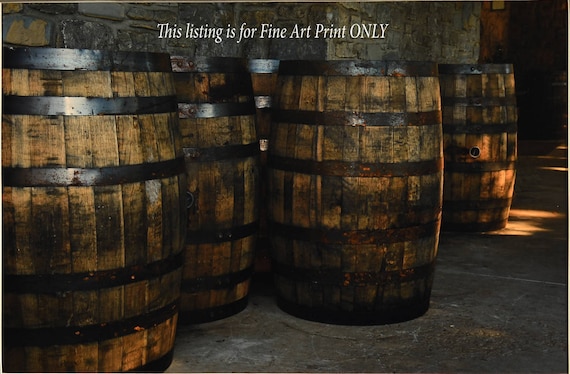
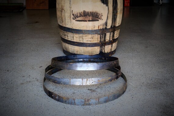
And of course, once I knocked all that out, I had something I liked... but could not leave alone.  I kept thinking the bands (which are called hoops) looked better when they were all black.  In my mind's eye, I guess what I imagined were beer barrels were closer to older barrels.  New ones have a shiny steel look, but I prefer an older "just rolled up out of the cellar" look.

The barrels on the left were probably made with a 3D printer.  It's my first time painting something made this way, and I felt many details were missing.  The paint slips in between the cracks of the plastic "tubes" with brush painting.  I think an airbrush would work a lot better with these.

More on the thing in the middle on the next post.

On the subject of corks... I always love having terrain that a mini can stand on.  So I drilled a small hole in the top of each of the kegs, and glued in a magnet.  That will be our cork.

Barrel/Cask Color Scheme
  • Hoop - Reaper HD Armor Grey, Edges Reaper HD Ash Grey
  • Lower Hoop Areas - Dusky Skin Shadow, Dark Skin Shadow, Vallejo Black 
  • Gleam transition - Reaper HD Ash Grey, Reaper Cloudy Grey, touch of Vallejo Turquoise or Reaper Misty Grey
  • Cork  - FolkArt Butter Pecan Base with heavy Reaper HD Golden Brown glaze, Reaper Dark Skin Shadow border with Fair Skin and Bloodless Skin Highlights (more on this)

Zooming in on cork you see a "flaky" pattern that I wanted to replicate.  Being the magnets are so small, I thought the best method would be to layer the dark up to the light - rather than base with wash and borders painted on.

That of course makes this first pic a complete lie because it's so washed out the color is too bright.  But keep my theory in mind.  I'm still on the fence as to whether I should have stopped at #2.
1) Butter Pecan Base.  On the top one you can see I started adding the Dark Skin Shadow to get the cork texture.

2) Heavy Glaze of HD Golden Brown, and then add more cork texture (Dark Skin Shadow)
3) paint in the highlight (Fair/Bloodless Skin) inside the border

The lighter colors were too bright for the color scheme I was going for.

Anyway...  Next I really wanted to recreate the hoop gleam from my main picture reference.  There's a touch of blue in some of the gleam which I used the Turquoise from NMM.  Newer barrels don't seem to have that color in hoop.  Older hoops seem to have that variance in color.

In this starting pic, you can see the where I had the shadows beginning with a heavy glaze of the Darker Skin tones to delineate where the transitions would be.


Brown added below the middle of the hoop to show where the shadow begins.

Just above the shadow line, I used Reaper Cloudy Grey and Misty Grey for strongest highlight and  Heavy Glaze of Vallejo Turquoise to get the metal gleam right.

A little heavy glaze of Reaper Armor Grey around the gleam to smooth the transition.

The painting experience on this was a little frustrating due to the 3D printed stuff not taking the paint too well.  Even when completed, you can see bits that stick out compared to the D&D ones which made from a mold. That said, getting practice on the metallic "gleam" was good experience.


This seems like a lot of time on the style for barrels and casks. Part of all this work is to hopefully get better at knocking this stuff out quickly.  Mastering the little details hopefully builds talent. But there's another reason. In fact, someone once asked me this very question...