Tuesday, January 5, 2016

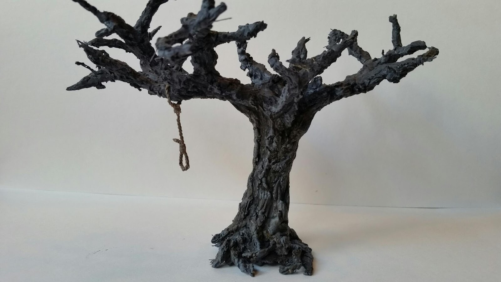
The Hanging Tree 2: Bark Is Not Brown

I originally wanted the tree to have a dead look to it, which from what I've seen, meant no brown.  But when I looked at what I had at the close of my first post, which had no brown, I wasn't happy. 

So with my very grey-looking tree, I used some dry-brushed in some FolkArt Mushroom and then Barn Wood on top.  I also washed in some more black, FolkArt Coffee Bean and FolkArt Fawn.

Still not happy.  Now it just looked like a stone tree.

So I looked up a few trees that were actually used as gallows trees.  Running this one picture through Reaper's Power Pallete (such an awesome tool) - yes, the greys are there, like the Ashen Grey I used - but it's juxtaposed with strips of olive and mossy greens.

Meanwhile running this picture of another in Texas the undercoat has very dark browns - like in a brown liner or walnut brown.  But where the light hits is a dark muted greyish-purple, which Reaper notes it as Dark Elf Shadow and Dusky Skin Shadow.

My painting buddy and I were talking about the color palette trees. During the winter season, I see a lot of leafless trees on my walks.  We both observed that - despite all your crayon drawings as kid to the contrary - most trees are not brown. Or at least not the bark of most tree (pine trees excepted).  The outermost layer of bark (called "cork") is usually grey. Couple layers under that is secondary phelloderm, which is more brown.

Eventually I got it right or close to right.  Its all about washes. Rich brown washes in the underside shadows, mossy green washes on the side hidden from the sun, and some final very wet black wash to end.  A little dove grey highlights at the top, but otherwise its all in the wash.

Here's the backside...

The Hanging Tree 1: Framing It Up

So in Malifaux, the Hanging Tree is an iconic landmark to warn visitors and immigrants to obey the law or dangle from a rope. It's the third thing travelers on the train see before pulling into the Malifaux. There's a cool official mini that Wyrd sells on holidays, and I've always been tempted to buy it, but the price tag is a big turn-off.
Since I've been reading more terrain blogs and watching some videos, that cost-effective voice perks up and says, "I could do this myself."
So here goes my Xmas 2015 experiment.
I'd kept and old extension cord ever since I saw this YouTube video on making wire frames for miniature trees.  So one game session I stripped it and made a tree with one long arm perfect for a rope to throw around.

Knowing I had to apply wood filler, I applied some masking tape so it had something to stick to.  Here's a shot of the the taped up frame with some putty applied to the trunk. 


I'd tried some white wood filler from a tube on another mini but nothing got the wood feel quite like this stuff from Elmers. It's pretty amazing how little you have to apply. But you really need to make sure you get some watered down PVA glue or wood glue to harden it up after it dries.  It crumbles really easily and moving it around is a mistake.

Slowly adding filler up the branches...

Filler progressing up the tree.

At this point, I realized some of those branch ends had to go.  Time to trim them up.

As to the base, I added some spackle to get a simple impression of the trees underside.  Spackle works for that dirt feel (though like the wood filler, it needs some watered down PVA glue to harden it up).


The Hanging' Tree sits by the entryway to the city so I wanted to get some city cobblestone underneath - to get that  impression this evil tree is bursting up over the city, unable to be subjugated. The green stuff was used for  cobblestone  (once again, using miniGirl's template). Spackle was used for the dirt.
Applied my Terraclips City color scheme, and some Burnt Umber for the dirt color.
Had to break to hangman's rope into two sections: the rope around the tree and the noose. For the noose, I used "InstaMold" to copy the noose from the Malifaux Bayou Accessories pack.For the rope, I straightened two paper clips and then twisted them together to create the rope hanging from the branch.

I primed the whole tree section with Army Painter Uniform Grey, and did a little black wash but I decided against drybrushing white.  Most dead trees seem to have a strong grey hue so muting that as the undercoat I felt would undo a good start.  The rope I gave a light brown coat - combining Linen and Coffee Bean (FolkArt).
I eventually decided on using Reaper's Ashen Brown from their HD line as the main coat. Its a very muted brown with a hint of purple to warm it up a little. I watered it down to a thing glaze and gave two coats. The first went everyehere. The second was more selective, leaving some if the knot holes untouched for the grey to come through.

More to come.

Friday, January 1, 2016

Vasilisa 2: The Duller Details

After my first pass on Vasilisa, I feel I'm looking at someone dressed in bright interesting colors yet is supposed to have been through the wastelands.
In the same breath, the wood grain got a little too faded thanks to over-applying the dark Walnut brown glaze by accident.
So first up to fix: that cloak - too bright a purple.  So I mixed the base color (Ceramcoat Purple Smoke) with a little Dirty Grey for a heavy glaze to dull it down. Conversely, I took a little of the wood grain base (FolkArt Teddy Bear Tan) with a brighter yellow (FolkArt Buttercup) to punch it up in the muddy areas.

I started working a plaid design that I figured was appropriate for all the half cloaks I'd seen. I wanted something detailed but not really interesting, like a tartan.  Using the colors I already on the figure I pulled a pattern together on my pallette.


The tricky part was applying the stripes in a realistic way that clothing hangs - especially since I've broken her cloak into two pieces.  I found a pic or two that was a little helpful, but getting a good 180° view was night impossible.  Time to just put brush to figure and wing it.


I eventually got something that was okay.


The pattern by the arm holding the spool (not yet attached) was messy.  The lines didn't meet up exactly and I had to flub it a little.  It's noticeable to me, though not sure it's as obvious to others.

Here's she is on the base. Front side...


.... and backside.

Sunday, October 4, 2015

Vasilisa 1: Contrast to Collodi

Next up from the Master of Puppets set was the new Henchman introduced in Malifaux 2E, Vasilisa. Her story is thematically is the same as Collodi's, but her style couldn't be more different.  Where Collodi had the lush appearance of a stage performer, Vasilisa looked like an old woman in a babushka.  Or something like a babushka, cos I'm still not sure what that is she's wearing.  It's somewhere between a headscarf and a poncho or halfcloak.

One thing I learned to do after painting pieces after I assembled them: hold off on assembling if there's a hard to reach area.  On Vasilisa, this meant don't assemble the one arm reaching into the side bag for a spool.  Paint the inside of that bag first... THEN glue the arm on. It's hard to get the finer details right when there's a obtrusive yet delicate piece in the way.

I always go for the "under" layer first, which normally means putting on flesh color. Here it means wood grain. So I did my brown lines with a heavy glaze of FolkArt Teddy Bear Tan, as I had with Collodi. 

Now for the overall paint scheme. She obviously has an old sewing woman look, but what exactly did an old sewing woman look like about 100 years ago? *shrugs*  Let's see what the Internets have to say.

Results: Do I trust Charles Edward Wilson? Okay. Yeah. *shrugs again* Sure, I do.

I decided that she would have a couple different colors involved.  An off-white for the apron, FolkArt Olive Green for the dress, a duller purple for the ratty old cloak, a dull beige for the babushka (FolkArt Barn Wood) - and if Charles Edward Wilson is to be trusted -  some plaid stripes over top.

Her cane I just did two heavy washes of Folkart Walnut Brown.

I wanted to get a nice yellow-brown leather on the bags and straps so I chose FolkArt English Mustard.  Honestly though, this is mostly because it reminds me of Games Workshop's Snakebite Leather, the one color GW I felt nailed.

Overall, I was shooting for a color scheme that would not be as lush as Collodi's, yet still use some of the same base colors (purple, yellow, green). That presented some challenges. For example, a dark cloak seemed like a good idea so I chose what I thought would be a muted purple. 

But it still came off too bright.  So there were some items to clean up on the second pass.

Wednesday, September 30, 2015

Collodi 4: Tightening the Strings

While I finally hit the color scheme I liked, I needed some separation on the stripes. I tried a darker purple but the colors were too dark and it just faded in. So black it had to be.

I also liked the near silver tone in the pattern that ran down the middle of the gild stripe, but didn't want to go through the aggravation of drawing out the actual pattern itself.

I used a very thinned-out white wash for the highlights on the folds and thinned out black wash for the shadows on the folds.

On the underside of his tri-corner hat, I found a little bump that may have been from when I cut him off the sprue. Rather than try to cut it off and re-do the painting, I figured I'd highlight it, like it was a gem or a decoration.  I actually think it looks like it belongs there.

Over all, very pleased with the faux wood grain I painted in.


I used a little FolkArt Midnight Blue to get a darker, near-velvet deeper tone.  

Sunday, September 27, 2015

Collodi 3: Colors on the Puppeteer

Wyrd makes miniatures that are insanely detailed for plastic, and insanely complicated to put together. My FLGS pointed out that I should grateful I don't play Von Schill and had to assemble his Steam Trunk. I am.

But for all the details, I'm a little surprised they didn't make the wood look like wood. So I added the detail myself.  I applied little wood lines with Van Dyke Brown like I had on the straight razor and the rolling pin on Collodi's party crashers.

I searched for a color scheme I thought would be comparable to an Italian puppeteer. I eventually found one I fell in love with as it had that beautiful shade of purple that was very stylish.

For reference, that's a Venetian marionette of Mangiafuoco - the evil puppeteer who kidnaps Pinocchio in the story written by Collodi himself. If that's not a nest of intertwined references - I don't know what is.

Liking the color scheme meant more stripes to paint. My first pass was FolkArt Raspberry Wine and Olive Green.
.

The back had a lot more folds. It was kind of fun trying to draw a straight line and see where the brush took me. The overall effect to me looked like he was stepping his right foot forward, and the cloak on the floor was dragging in that motion.

The topmost green stripe should have gone all the way to the edge of the overcoat. so I had a little repainting to do.  But what really bugged me was what I painted looked less a  stylish wardrobe and more a Rita's Water Ice sign. It all had to do with that FolkArt Raspberry Wine color. 

My painting buddy happened to have a Ceramcoat Grape handy which blended into this beautiful royal color. Once I re-painted the stripes with this color I knew that's what the hat and robe should be. One catch I ran into when I went home to do some touch-ups: According to a discontinued Delta color chart I found online, Delta no longer makes "Grape". Did a little testing and eventually found Anita's Violet was a decent match. But the search made real something I already suspected: most paint lines have slew's of options for tans, browns, yellows, greens, oranges and blues - but purple is much more limited.  You really have to borrow from different paint lines to get a good palette. 

FolkArt Teddy Bear Tan was the middle stripe.  For the wood, I followed the same pattern as the wood handle on his doll friend's straight razor: VanDyke Brown lines, heavy glaze of Teddy Bear Tan, but this time I used a wash of FolkArt Coffee Bean. Brushed off that last wash on places to give it more of the uneven tone that wood grain has.

Back of the robes delivered what I wanted on a first coat, though it obviously needed some shading to bring out the "swanky" velvet sheen I wanted.

Had to put him on the base just for sizing him up and make sure I'm still headed in the right direction.

With that confirmed, it's onto the finer details.

Friday, September 25, 2015

Collodi 2: More Puppet Friends Crash Home Base

So with Reaper's hankercheif ghost done, I knocked out two more to crash the party on Collodi's base: the Reaper "doll with knife" from the Familiar IX pack and Reaper Gingerbread Man from the Familiar IV pack.

First one up was a personal fave mini of mine. I really wanted to paint this guy a while. Could have gone for a wood tone, but I was more partial to an old discarded doll look. 

Primed white, black wash. First coat was a glaze of FolkArt Cappuccino, which has a very fake orange-y tone to it. I wanted a "not real" look to it so that was fine. Then I did some heavier coats with Reaper Tanned Skin and Tanned Highlight. Cracks in the head were painted on, inspired by some creepy dolls I googled.


Couldn't let the straight razor have a plain black color, since I thought most older ones had a wood handle. So I painted in the wood lines in Van Dyke Brown and did a heavy glaze of FolkArt Teddy Bear Tan. 

Next up was psycho gingerbread man. This guy was a simple paint, color scheme based more on the Shrek character "Gingy". Just as funny, but more insane looking.

Not ironically, his main color was Reaper Ginger Cookie. The wood lines on the rolling pin were painted on with Van Dyke Brown and a heavy Delta Ceramcoat Cinnamon glaze (don't leave home without it).

I liked this method of "painting in" the wood grain pattern. Good timing since I needed to do something to help Collodi's look along.