Thursday, August 15, 2019

Swine Cursed 1: The Gremlin-Pig Lycanthrope

Werewolves scared me as a kid.  I didn't need to see An American Werewolf in London in theaters as a kid because the commercials alone kept me up at night.  I was only ten when it came out, so I'm sure an analyst would point out it was all my fear of the inevitability of adulthood.  Or perhaps more accurately, the dread of puberty.

But when I think on it, the real scare was always the loss of control over your body.  Disease doesn't tap that fear so much as the loss of your mental capacities to control your body, your actions, your words -- even your thoughts. In a minute, your mind has kicked out your personality like a bad renter. Or worse yet some small subconscious flaw has back-doored an outside influence to wrest command of the entire ship.

It sort of compliments the imitator fear in that you fit right into the new world that the Body Snatchers built without your conscious acknowledgment.

You secretly wanted this.  That's why the lycanthrope imprint took hold.

That said, the Swine-Cursed isn't a scary figure but an homage to the trope with a wink. Instead of man-into-beast, we have gremlin-into-beast. At first glance, there's a fun juxtaposition that's a send-up of the werewolf. The gremlin of folklore engages in subtle mischief, causing things that work to malfunction. Whereas the swine is represents consumption gone wrong, or as Bricktop would say -- is as "greedy as a pig".

Of course, in Malifaux there's more in kind between gremlins and pigs. Malifaux gremlins are more reckless to the point of no self-preservation. And Malifaux pigs charge into gobble up anything that gets to close to them.  So I see it more as the "imprint took hold" idea.

As to the minis, I like this one particular pose of the standing figure. It's the classic werewolf howl stance.   I see the color scheme in mid-transformation between gremlin and pig which I figured would be a fun challenge to get both tones right, especially since green and pink don't blend well.

Above all I wanted to avoid making them look like a boar lycanthrope.  For the uninitiated, that's an old D&D monster called wereboar.  World of Warcraft has a similar looking creature called a quillboar.  Both are all brown and red earth-tones.

Swine-Cursed Color Scheme
  • Gremlin Skin - Base: Reaper Fair Skin and Worn Olive, Wash: Reaper Worn Olive, Highlight: Reaper Moldy Skin 
  • Pig Skin - Base for Main Skintone: Reaper Maiden Flesh mixed with Entrail Pink then a thin wash of Maiden Flesh overtop
  • Transition from Gremlin to Pig - Heavy glazes of Reaper Maiden Flesh between the two
  • Overalls -  Heavy Glaze of Sky Blue (I changed this later on though to Reaper HD Golden Brown and Delta Ceramcoat Autumn Brown)

Unfortunately, I forgot to take initial coat pictures.  But it was white primer, black paint wash for separation and some base coats as listed above.

I decided to make the transformation to go from the upper extremities inward.  The arms and face were the most distorted and pig-like with a pink tone, while the torso and legs were gremlin with a green tone.  But while the face was fine - the arms came off mismatched, not transitional.  It looked as an action figure had the wrong arms popped in, complete with demarcation gap. 

So I pulled the gremlin green skin tone further down the shoulder and onto the bicep.  That fixed the action figure problem.  I put this figure down for a few days and would walk past it every now and again...

... and I still didn't like what I saw.  The blue color overalls clashed with the other colors on the figure.  So it was time to change it to brown. 
The overall result was... okay.  I don't think I used enough colors here.  But I learned a lot about undercoating and heavy glazes as a result of this (the main lesson: actually use an undercoat on a figure with a transition scheme *facepalm*).  

So... less a successful paint job than a successful painting experience.


Saturday, August 3, 2019

Doppleganger: Fear of the Imitator

This is a sharp left turn from my previous post on dogs, but it has a happy ending.  So hang in with me on this.

Last month, I was dreaming that my puppy was acting strange - almost feral - whenever she was in my peripheral vision.

A vet came to our house and said, "This is not your dog.  It's an imitation.  Right now, the imitator has taken a hold of your dog and she's like a zombie version of her former self.  The only way to get her back is to kill the thing you see before you." 

And he handed me a rock.

I braced myself, sighed, and swung the rock at her head. The blow didn't finish the job. She looked up at me, like she does in the photos my wife takes when she's at her cutest with big pleading eyes.  Except now the side of her skull was lopsided and blood was pouring out of her nose and mouth.

I dispassionately swung the rock again - as if I were performing a task.

And then I woke up... horrified at the dream but moreso at myself.  What the hell was wrong with me?  (And no, I hadn't re-watched The Thing the night before.)

My worst nightmares are always about the imitator.  

And my worst recurring nightmare is right out of "Invasion of the Body Snatchers": someone has clearly been replaced by a copy.  More people start acting strange and I become concerned. Then, everyone I confide in tells me to stop worrying... and here, eat this strange food I've never seen before.  Or drink this cup of milk with a thick mist rolling off the brim.  Or just step in this shadowed back room and relax. Or just close your eyes - we have a surprise for you (no peeking).

I had a string of nightmares like this almost every night during my first trip to Ireland.

I recognize these nightmares are rooted around change and fear of it.  I used to think it was based around the fear that those around you have flipped their moral positions.  Or everyone has started buying into some new hip philosophy that is terribly flawed, one that seeks my own death in a way that everyone else is steadfastly ignorant of.   

While these might be the root for some, I've figured out my nightmares stem from the opposite: I have changed -- or had to change -- and my psyche is straining to catch up.

The first time I pieced it together was all those years ago in Ireland.  During the trip, I became enchanted with the land, the viridity, the people, the stout. Then, the doppelganger nightmares every night. After one rather awful nightmare, I awoke with the clarity that the one who was changing was me, not my surroundings: I had adopted a slight brogue. So I forced myself to stop speaking with the lilt I was so charmed by (and cease what was probably an embarrassing cultural appropriation). I reaffirmed to myself I was a Northeastern American on travel.

The nightmares stopped.

My most recent imitator nightmare definitely revolved around the death of our previous dog, Ammi, and the transition to our new dog.   Ammi's passing left behind a void in our household, and we were lucky to locate a dog that filled it so perfectly.  But I was still struggling with moving on; it was harder on me than I wanted to admit to myself. And my kill-the-fake-puppy nightmare manifested from my lingering numbness, fresh emotional confusion and guilt. 

Numbness over the constant clean up as Ammi slowly lost control of her body and more of her personality. 

Confusion over caring so deeply for a new dog when I still cared so deeply for Ammi.

Guilt over "replacing" her, probably sooner than I was ready to admit to myself. 

Things changed but I was struggling to keep up.   But like most fears, once faced into light, the nightmares dissipate.  Once I realized the root of the issue, I came to peace with the situation.  The nightmares stopped.

So... before I move onto to facing the paint job, I want to clarify a few things

First, Spelling: Malifaux spells their creature doppleganger rather than doppelganger, which comes from the German doppelgänger.

Second, the creature definitely draws for the D&D-ish interpretation of doppelganger - a monster who has supernatural powers to imitate a person - rather than the more innocuous "twin stranger".

Third: the figure itself.  The Malifaux Doppleganger figure can be painted two ways: one as if she's holding a towel, one as if she's grabbing a newly acquired sheet of skin to be added to complete her/its masquerade.  

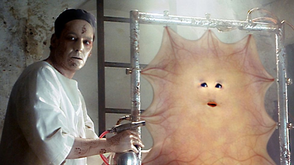
I've seen many done as a towel, so I chose the latter. The sheet of skin needed something to define it a bit. My inspiration to use veins was Cassandra from the first season of the rebooted Dr. Who series.

Doppleganger Color Scheme
  • Skin - Main Base: Heavy Glaze of Reaper Tanned Highlight, Shadow (Wash): Reaper Tanned Skin, Highlights: Reaper Fair Skin
  • Muscular Bits -  Main Base: Reaper HD Brilliant Red, Shadow (Wash): Delta Ceramcoat Cinnamon, Highlights: Reaper HD Entrail Pink
  • Hair - Base: Thinned Vallejo Black, Shadow (Wash): Vallejo Black
  • Red and Blue Veins - Undertone Base: Reaper HD Brilliant Red and FolkArt Solid Blue, Shadow (Wash): Heavy Glaze of Reaper Tanned Highlight
  • Viscera - Base: Tamirya Tamiya Clear Red paint, Uhu glue, Vallejo Black (see post from chestofcolors.com)

So I used my standard procedure for painting eyes - which i have learned is to do the eye first.  Disappointingly, the awesome The Craft forums on reapermini.com where I got this idea from has now been taken down.  You can still see ghost references for this method on pinterest.

Anyway, the concept is paint the white of the eye.  Then paint a black dot for the pupil. If you screw up, it's easy to fix because you just start from white again without screwing up a perfectly painted face. 

Then paint everything around the eye in black, slowly making sure you don't nick the white of the eye.  Then paint you skin base coats on the face.

For this figure, I got a deceptively coy, almost anime-like big-eyed expression on the figure.  I was very happy at this point.

Dripping blood would definitely distinguish a sheet of skin from a towel. So I tried a new method I read about from chest of colors. The idea is to make a sticky red "goop" that you pull between areas to get the stringiness of fresh blood.  

Dropped a big wad of the goop and pulled it up to the sheet.  For a first time, I was really proud. Beaming, I showed this off to my wife - who said this looked more like... something else... was shooting from between her legs than it did the sheet dripping.  

Very embarrassed , I took an exacto knife and cut off most of the dried goop. Then applied a method that I've seen for drool that uses fishing line and super glue.  That got a coat of Tamirya Red.  

Big improvement.


In retrospect, this figure would have looked a lot better if I'd done a reddish skin tone as an undercoat, then done the veins and then a heavy glaze work of the base skin tone.


Wednesday, July 31, 2019

Trees and Contrast Paints

If not obvious already, I love using terrain in a wargame and RPGs with miniatures.

But I didn't always have this appreciation. Most RPG's I played in the 80's and 90's used "theater of the mind" to visualize spaces. This style of play relies on the game master to communicate the placement of all the relevant pieces in an encounter.  (Map drawing helps too.) 

But after having played with a group who frequently uses terrain and miniatures, there's an immersive experience that prevents me from going back to the theater of the mind.

Mini painting soon became a creative outlet - as I wanted to re-create the same environment my gaming group had. 

Then it became an addiction.  Seeing a unique figure plants the seeds of encounters and adventures. It even forces you to pick up more mundane objects.  I'd purchase figures I might not use, but looked too cool to pass by.

Then it became a storage concern with the advent of Kickstarter and the board game revolution.  Decent unpainted plastic minis came cheap.

And now, I'm reflecting on all this hobby consumerism gone wild.  I'm refocusing on its personal importance and artistic value. 

It's also partially because I inherited a small terrain legacy.

I had a friend who I knew to be a gamer. We'd chat about figures we picked up, but where I was focused on grabbing one or two figures - sweating over which highlight to use - he went the pre-painted miniature route. Then pre-painted terrain.  That eventually became 3D-printed terrain.  His mission was to create the ultimate campaign.  Four 3D printers ran non-stop making houses, towers and trees.

But he passed away before he got to run his ultimate campaign.

His family was looking to clear out his home. No one - not even gaming stores - wanted his unpainted 3D-printed stuff.  I grabbed all of it before they hit the curb.

Conflicting feelings car-crashed in me:
  • Responsibility - I cannot let my friend's work go unnoticed or unlived.  There's a unrealized dream behind every tree he printed. 
  • Panic  - There's not enough time and space to paint all his stuff, much less complete my own surplus. 
While I have come to terms that I have some auction-purging to do, I will note that Games Workshop's Contrast Paints came at just the right time.  The "one coat and done" has a great appeal to knock out some of my new acquisitions.

And since I had a lot of new trees, it was time to start there.

First - white primer.

For my First Trial, I used five colors from the Citadel Contrast paint line. These colors are dark to light and I used them from bottom-to-top: Dark Angels Green, Camo Green, Ork Flesh, Militarium Green, Plauguebearer Flesh.

Realizing that these paints are very thin, I heavy-loaded the brush to be able to move the paint around on the figure to do some wet-blending.  But starting from the bottom up, the paint was constantly dripping down and collecting under the tree and running on to the trunk.


With washes, you can mop off the run-off with a clean brush. But with Contrast Paint this made smears everywhere.  The only chance to really save other areas that get spilled onto is to catch the paint before is slides into the area - which defeats the purpose of saving time.

So I learned something very important with Contrast Paints:
  1. make sure any wet blending is done above an unpainted area so you paint over with white or grey again
  2. most importantly - start from the top down

So here we go top down starting with Plauguebearer Flesh...

... then Ork Flesh...

... some wet Blending more Plauguebearer Flesh in with Ork Flesh...

... Militarium Green as a wash for top area...


... then Creed Camo to transition into darker areas...


... and finally Dark Angels Green with no run-off!

So far, very good.  Onto Bark work. (We will not use brown.) I have three examples.  One starting with Grey Primer with Skeleton Horde.

Another using White primer with Basilicanum Grey. 

Finally, White Primer with a quick base coat of FolkArt Barn Wood and then Basilicanum Grey 

Final part bases.  Old bright brown - Delta Ceramcoat Autumn Brown with a Contrast paint Cygor Brown


Final trees before adding any flock on the base.
Grey Primed (probably my favorite).

White Primed with no basecoat on the bark. Has almost a birch look to it.

White Primed with Barn Wood basecoat on the bark.  The not-quite-done print job on this showed a lot of lines on sculpt. 


Overall this is an expensive way to paint this.  But the speed combined with detailed look is just what I need to get things done!

Sunday, June 30, 2019

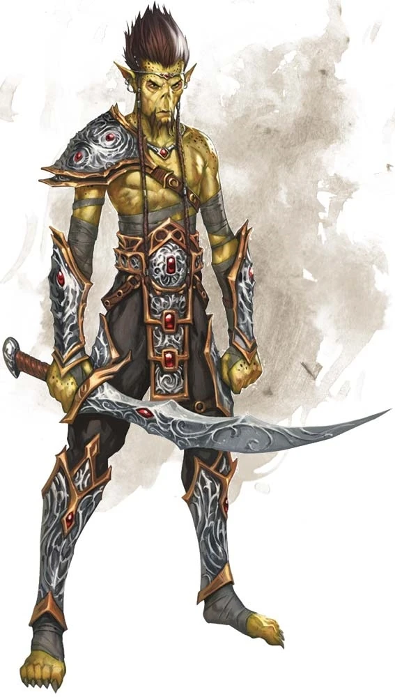
Githyanki: Best Fiend

In September 1983, a thirteen-year-old version of myself was staring at a ditto sheet entitled, "Name three (3) books you read during the summer".  It happened to be a summer I didn't read very much, which was unusual for me.  My mother kept yelling at me to read "A Light in the Forest". I struggled with the pacing and daydreamed too often.  Eventually I wrote down:
  • A Light in the Forest 
  • Johnathan Livingston Seagull
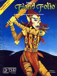
  • Fiend Folio (Dungeons and Dragons)
The hours mulling over the creatures in the book is probably what fueled all my daydreams.  Needleman and slaad. Penanggalan and forlarren.  Eye of Fear and Flame.  One entry rebirthed my childhood fascination with scarecrows.  I remember dreaming about whether one could play out an encounter with a revenant just like the splash page.

Not all were great.  The triapheg looked like a couple melted mannequins repurposed for a low-budget sci-fi film. When I saw Wes Craven's Shocker, I thought, "This movie is so bad, it actually makes the old monster look frightening."  And the adherer ranks among some of D&D's goofier creations (although they got a fantastic new coat of paint in Misfit Monsters Revisited and got a lot of love from me.)

But the best fiend of the folio was posted on the cover - the githyanki.
   Survivors of a long enslavement, descendents of a rebel, now living in the Astral Plane, as ruthless pillagers with silver swords.

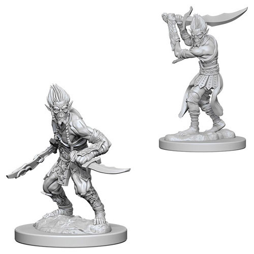
So my old college roommate surprised me by announcing he was playing D&D again and convinced his DM to play a githyanki.   Immediately shuffling through my mini shopping sites, I found a pair of Nolzur's Marvelous Unpainted Miniatures githyanki.  

I wanted to recreate the classic Fiend Folio cover, though admittedly the color palette needed a little updating. I'm not going to have a lush blue background so all those yellow-browns, brownish-yellows and gold colors are going to look flat.

Leafing through google, I found some great updated reference pics: 
  • the one I remember fondly from 3E by Sam Wood
  • one by Wayne A. Reynolds - though his colors are overlit by a blue light source 
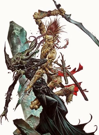
  • this personal fave by Wayne A. Reynolds - where a githyanki is in full swing, dicing up a mind flayer 
  • but probably the best reference for this figure is this one from the 5E manual

Githyanki Color Scheme
  • Face and Skin - Base: Vallejo Khaki then a glaze of FolkArt Teddy Bear Tan, Shadow (Wash): FolkArt Ochre Yellow, Highlight: FolkArt Buttercup, Undershadow: Reaper Tanned Highlight, Deep Shadow: Mix of Reaper Ghoul Skin and Tanned Highlight
  • Wraps - Base: Reaper Ashen Brown, Wash: FolkArt Walnut Brown, Highlight: Reaper Dusky Skin Highlight
  • Bracer straps and defensive skirt - Base: Delta Ceramcoat Cinnamon, Wash: Reaper Dark Highlight
  • Straps - Base: Reaper HD Golden Brown, Wash: Reaper Dark Highlight, Highlight: FolkArt English Mustard
  • Eyes - Base: FolkArt Autumn Leaves with Mix of Autumn Leaves and Antique White in middle
  • Hair - Base: Delta Ceramcoat Cinnamon, Wash: Reaper Dark Highlight
  • Lioncloth - Base: Delta Ceramcoat Cinnamon, Wash: Mix of Reaper Dark Shadow and Cinnamon, Highlight 2: FolkArt Autumn Leaves
Githyanki Base Color Scheme
  • Rocky texture - Base: Reaper HD Ash Grey, Shadow (Wash): Reaper HD Solid Blue, Highlight: Mix of Reaper HD Ash Grey and Misty Grey, Undershadow: Reaper HD Military Grey, Final Glaze: Mix of Reaper HD Ash Grey
Plastic minis always come with an annoying amount of flash.  I've noted where bits needed filing or cutting on the forearms and the arms...

...on the arm straps, the loincloth, the wrappings on the legs...

...on the hands and sword handle...

  ...and under the arms.


Black Wash, work on the eye. Very happy with the squint in the left eye, but the right eye was too blotted out with the black color.  At the time, I thought I would be okay with it.  I wasn't. 


First pass on skin color.  Embarrassed to say I can't remember exactly what color I used here. Either it was a Vallejo Khaki or FolkArt Teddy Bear Tan.  I would revisit that right eye (stage left) later.

As I started filling in my first coat, I found some gaps in my palette plan, specifically on the wraps around the legs and arms. 

  • The belt would look best in gold and browns.  But I had to be careful not to overuse those colors against a yellow skin.  
  • Other browns would be needed to help separate the NMM golds.  
  • Reds and reddish browns had been taken by the loincloth, hair, and the defensive leather skirt (which to borrow a term from the Romans is called a "pteruges").  One other minor challenge: the githyanki on the old FF cover didn't have the leather pteruges (or definitive legs for that matter).

So with a palette drowning in yellows, browns and reds - another color was needed for the wraps. So it needed to be a dull color that wouldn't confuse the palette.  Reaper's HD Ashen Brown - with its muted purplish beige - came to the rescue.

Cinnamon and brown wash to get that reddish brown leather look on the pteruges and bracer straps.

While hard to see below, I fixed the right eye. That done, it was onto practicing my NMM abilities on the sword.  With a base coat of Reaper HD Armor Grey, I had to consider colors for the githyanki's legendary silver swords.  I considered a sterling silver look, but opted to emphasize the peaks similar to the edge at the base of this sword. 

First pass on sword.  The back of sword is correct but the front lines were all wrong.    


Starting over again on the front of sword with a solid base coat of Vallejo Cold Grey.  

Also, the mold defects began to show its faults on the front bracer. It lacked detail and the layers were more lumpy.  So normal NMM painting techniques - feathering glazes toward edges and applying washes to the recesses edges - don't work.  This would have to be manually fixed later on.


Some gemwork.  Cool blue as an accent helped give it a little pop.


Finally fixed front bracer and front of sword.


So a quick note on the smirk.  I was painting a thin black line between the lips for a little separation.  Unfortunately, I ended up giving him a happy smile.  Correction required adding more of the yellow flesh color, which needed several passes since black-on-yellow mistakes need multiple coats of yellow to hide.  You can see the results on the left - a serious expression with a squint to consider where to put the blade.

In the final stages, I was adding a thin glaze of FolkArt Buttercup to the lip area.  When I was done he got a bit of the smile back.  But this time it was a small smirk. 

These are the moments I love in the creative process.  I didn't plan on that smirk - I was actively avoiding it.  But sometimes the piece tells you what it wants. 


Now - time for the base.  Evoking the otherworldly Astral Plane feel from the old 1982 Fiend Folio meant imitating the blue background on the base itself.  

Some small wisps like what I did with the Widow Weaver would also be key in creating that extra-planar feel.  But I had to ship this to Germany... and I knew from experience cotton/PVA would get re-shaped in shipment.  It would be best to have the wisps of mist removable.

That meant - magnets again!  First step, I drilled some holes first.


Next I filled the holes in with green stuff and let it cure overnight.  Next day I put some saran wrap around the figure.  I put some pins on the magnet areas (below).  Finally I would mold green stuff over the pins.  That way the "bits" holding the wisps would retain the shape of the base.

Next was to paint the base and bits in the greys and blues listed above.  Then glue on the wisps.

Here's the result with and without mist wisps.


FINAL THOUGHTS
Never thought I'd say I missed the ability to assemble a mini!  Being able to paint piece separately would have "de-complicated" painting the areas in between the arms.  That said, I would have never enjoyed assembling the arms together.

Also not a fan of the type of plastic used here.  Flash is near impossible to remove.

I also need to study painting the final highlights on skin better to get the "shine" of skin more realistic.  I could have gotten some of those bits a little sharper.  But overall, I'm pleased with the results.


Thursday, June 6, 2019

Penelope: The Color of a Dog

Anthropologists credit humanity's survival against Neanderthals with its domestication of dogs.  This means my childhood home would probably have starved to death in ancient times. Growing up, everyone except myself had allergies to cats and dogs. So beyond the once-in-a-lifetime hamster and a series of fish, I never got to live with a pet until I was nearly in my 30's.

Although I'd always pictured myself as a cat person, I married into a dog home and converted. Look - I can admit I got very lucky in how I was eased into the dog world. My "starter" dog was very timid around other dogs and people - with the exception of my immediate family.  My second dog loved people but was anti-social with her own kind. Now, we're raising a puppy who is social with dogs and humans alike.

I really didn't start paying attention to the colors of a dog's coat until my second dog, Am-mi. She was visually striking. Her coat had a light-brown hue that would get very red in the summer, and dark fur pigmentation around her eyes that gave her an Elizabeth Taylor as Cleopatra look. Once a month, someone would comment she looked like a fox.  Every week, people stopped to ask me what breed she was. (The unimpressive answer: a mutt).

It's in these interactions that I recognized how often humans make that impulsive connection between coat and breed: a dog-lover's search to find the right companion that will meld with one's home. (Though now raising a puppy, I find I agree that the breed is really only as good as as the owner.)

So deciding what to paint my first canine figure carried some weight with me.  I'm looking at Penelope, Ulix's partner in herding pigs.  Malifaux books describe her as "a brown merle coat -- her eyes... ice blue in color."

The problem with painting her "merle" is that it looks Dalmatian-esque or a like a glaring palette mistake since the mutation neuters some pigmentation. I wanted my first foray into paint to not look unfinished.  So I opted to try my hand at a brindled coat instead. The brindle has a tiger stripe marking overtop of a more blotchy under-pattern.

Penelope Color Palette
  • Eyes - Black Dot: Vallejo Black; Center: Reaper Lighter French Blue
  • Muzzle  - Base: Reaper Cloudy Grey, Wash: Reaper Dusky Skin Shadow
  • Undercoat - Base: Reaper Desert Tan; Splotches: Reaper Golden Brown, Wash: FolkArt Coffee Bean
  • "Merle" Coat - Base: Mix of FolkArt Walnut Brown and Cloudy Grey (very thin) also Dusky Skin and Ashen Brown highlights
  • Chest & Forelegs - Base: Mixture of Reaper Desert Tan & Apple Barrel Antique White; Highlight: Reaper Bloodless Skin

First coats to get the blotchy under-pattern I mentioned above.  It looks like a failed pattern here, but I trusted my instincts that the brindle application would pull it together.
 

First passes on the brindle stripes filled the coat out they way I wanted.
  f


A few grey highlights to add some shine to the brindle stripes of the coat.


Overall very happy with the final pics.  The brindle coat came out the way I hoped it would - and it's a good day when you can say that!