Wednesday, December 31, 2014

Teddy 6: Re-pinning and calling it a day

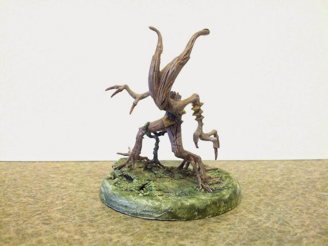
I looked further into why Teddy would not stand flat.  It was partially due to that Wyrd gave him rounded feet underneath.  That meant he stood more like a Weeble... but one who did fall down.

After re-touching up the dings and slips from the previous session with Teddy, I figured I could make it work by making it look just floating slightly above the pentagram, like he'd just been summoned.  A few shadows around the feet and blackening out the dried green stuff is what I'd need. But...


...I kept picking him up to see what brush would fit in under the insert.  One time I put him down and he just popped out of his pins.  And of course, a little paint came off with him.

Okay so I had clean-up painting and re-pinning work to do. But this time, I was going to make sure Teddy was going to stay in place.  He's a top-heavy mini.  Short-cutting with smaller pins didn't work.  Longer pins were needed. Abondon the floating look - get him as flat to the ground as possible. 

So time to route out the tabs underneath the base.  Say good-bye plastic tabs!  You're a nice idea, but just in the way...


The other thing that had to happen was filing down the excess metal from under the footpads.

This time, Teddy slid in place pretty nicely.

Bent the pins back, glued in place and added some washers to give that extra weight to the bottom.  Also I left one washer a little bumped underneath.  This way I could pick him up from the base during gameplay - without having to put my fingers all over Teddy himself.


Teddy finally looked good. A small voice in my head said, "You know what would really look good? A little bit of drool dripping out of his mouth, like he'd just been conjured up and is just salivating over sinking his teeth into you." And another voice answered, "YOU'RE DONE. Let it go, son."

So I'm calling Teddy done.

A few lessons learned:
  • The original Teddy mini has rounded feet. So once he's cut off the metal tab, there's filing that needs to be done
  • Always pin your minis first. I hesitated because of the weight.  Big mistake.
  • Never drill holes on a prefab inserts before they've been glued 
  • And if you've got a heavy mini where you're going to twist the pins under the base, file out the plastic tabs underneath the base before finalizing
  • White primer, black wash. Perfect combo for lighters colors that "pop"

Teddy 5: Pinning and other nuisances

I'd pickend up some Tamiya Clear Red as I'd read that was the best way to get some gory blood reds... And I really liked the effect that Klatu.org got on his Teddy.   But after going through all this work to get the badge, teeth, and lips right - dumping another set of colors overtop of what I've done made me very nervous.  If it didn't go on right, there was no way for me to fix it with out starting from scratch.

I threw some on some test skeletons (from Reaper's first Bones set), and was not thrilled with the results. Examples I've read from other painters had all these shades that fresh blood has.  Whereas what I did just looked like... paint.  I obviously needed more time to experiment with this style.

I ran the idea past my family. They convinced me that blood coming out of Teddy's mouth was too over the top.  Given my hesitancy, it wasn't hard to convince me.

That meant it was pinning time!  I hadn't yet glued the insert to the base, but I wanted to make sure the holes were in the right spots. So I pre-drilled some holes in the orphanage base and simultaneously the base itself.  (I would later come to regret doing this.) 

I also shaved some more metal off the pads of Teddy's feet to get him to stand flatter, and headed over to my buddy's house for a night of painting. I figured I'd knock the gluing and pinning process in an hour or less and get to finishing my Stitched Together models.

Upon arriving, I picked up my painting bag, it slipped and I cut open my forefinger with my thumbnail. (I still am unclear how I pulled this accident off.) I started getting real blood on the pentagram that was conjuring Teddy.  A little foreboding...


The gluing process didn't go smooth.  I struggled to get the holes in the base lined up with the orphanage insert before the glue dried.  I eventually used a rubber cement which gave me a little time to do the lining up.  When I finally got that I put Teddy in and tried using extra long pins and bending underneath the base to give the mini more stability.  (NOTE: I got this idea from the very informative HobbyGuy / MiniGirl #36 blog, though it looks like this episode has been taken down.)

But I didn't route out the plastic lips under the base like I normally do when I put my washers underneath. So I couldn't get a clear 45° angle to bend the pins. I ended up putting more elbow grease in and pulled the pins put of Teddy completely. And I scratched the paint off some of the boards. And more blood got on the summoning stone.

So I had to pull the pins out, recut them, and superglue them back into Ted.  This also meant that using green epoxy for extra stability was unavoidable at this point. It would be needed just where the pin was coming out of Teddy and under the base.  The end result was Teddy's feet would not hit the floor flatly. He's sort of levitating there above the summoning stone.  At this point, I called it a night.

Sunday, December 28, 2014

Xmas Break: Trip to Dali Museum

So my amazing family got me a slew of amazing miniatures I really wanted for Xmas. Then we promptly packed up and jumped on a plane to Florida for the rest of the holiday week - so I could do absolutely nothing about it.  But it was a well-needed break, and you really cannot complain about winter in Florida. Plus, I did manage to kick back and get inspired.

One of the best parts of doing anything creative - be it lyrics, music, poems, sculpture, game design, painting, whatever - is that you can pull your inspiration from anywhere. And anywhere you go, you look at things in more than one way: you have it as the experience (which everyone has), and you have it as a source of inspiration - a little idea factory. You have the moment and are thinking of ways of recapturing the moment - or at least a bit of it.

So seeing trees with Spanish moss is probably commonplace for anyone living in Florida but it was fascinating to me. It seemed like every tree on the highway that wasn't a palm was swamp background. 

Probably my favorite part (Painting reference-wise, anyway) was a stop at the St. Petersburg Dali Museum.  I caught a couple snaps (no flash, mind you) of bits that just made me stop and gawk.


Still Life (Fish with Red Bowl) is one of his earlier works but a couple things grabbed me.
After days of trying to get a plate to look right, it was an interesting study to see how a master got a shiny reflection in a bowl.

But that's nothing compared to the details on the fish scales.  I love how he got them to shine. Just incredible.

Portrait of my Dead Brother had multiple themes and styles going at once: a portrait, a pixel / stipple art effect, a hidden crow, soldiers and cherries.  There were dark and light cherries throughout the work; most looked like the ones at the bottom. But the 3-4 in the middle of this snap almost looked like they were in three dimensions. The slightly lighter outer ring made seemed to be the key effect.

 Landscapes from one of Dali earlier works... what caught me was what looked like multiple colors on the land.  But when I zoomed in on it, it really was just two colors.  Mostly a reddish brown clay color and a deep green Christmas wreath type green glaze.  Two colors I wouldn't have put together.

When you stand back like this the land looks natural.  Close up, I just wouldn't have put the two together.

Another lesser known painting which I don't know the name to (Angel or St. Someone at Lake Something-or-other).  But I loved how the angel sort of just blends into the lake with a slight black  (sometimes white) outline.

The only color bit in "Sentimental Colloquy".  What got me about this, other than the symbology of the piano and art, was the color of the water: it's simultaneously a rainbow palette and splashing - yet still obviously water.

"Still Life in Motion".  There is nothing to point out here other than the obvious: perfect technique.

Wednesday, December 24, 2014

Teddy 4: First Wash, Detail Clean-up and Badge of Frustration

Almost every miniature I paint has one spot that becomes the bane of my existence.  This miniature's bane will be the "t" and "e" in the word plate.

So I did a brown wash of FolkArt Teddy Bear Brown on key spots.  Did a little Coffee Bean and Van Dyke Brown to get some separation.  Also added this to the claws a little too to give it a more bone look. 

Also decided it was time to get Teddy on some pins before I started doing the detailed work.  I didn't want to do this earlier as Teddy is a heavy mini and needed as much support as possible.  But I couldn't delay it forever.  Otherwise I'd be putting my hands all over key details I might not be able to recreate. This part went smoothly.

Next up - make the plate look a little more like a plate rather than two concentric circles with a face.  I could have gone for the "admiral dinner plate" look. But I decided on a more classic plate reference.  Reaper's Power Palate tool is a god send. I've learned a lot about shading and tones in ways I never could see on my own.

Reaper's suggestion was their Ghost White on one side, Leather White on the other with Pure White for the highligts.  I used an icy blue, FolkArt Dove Grey and Folk Art Titanium White.  I also didn't get rid of the middle blue ring. Since I used glazes, it's there very subtly.  It's still a little too blue for my tastes though.

I gave the outer ring a thin line of pure black for separation.  That's where the trouble started.  The letters started getting in the way a little.  And the "T" in plate was just weird looking.  The cross was too slanted.  And the "E" was missing some definition.

So I fixed it... with the wrong font color.  I used a darker brown (Coffee Bean) by accident.  I forgot I had the font in the same color as the wash on the fur (Teddy Bear Brown).  So I glazed the "E" with a little white to fix it.  Then I trimmed back the cross in "T".  But it was on top of the "E".  So I whited out portions of the and redrew, but now the spacing is all off.
At some point, you have to realize you are your own worst enemy. So I stepped away to eat something and came back to fixing the font. A little TB Brown to fix the cross in the "T"... A little white between the "U" and "B"... And I felt it was a lot better.

Left Teddy for the day to experiment on blood a little (more on that later). Came back next day to tighten a few other details, namely:
  • Glaze of FolkArt Dove White to get more white plate than blue plate
  • Some more dark wash around the eyes to make the crazy pop more
  • Some yellowish color at the base of each tooth so they look more realistic (FolkArt Cappuccino)

Teddy 3: Orpanage Base

The urgent need to get some painting done pushed me towards purchasing a pre-sculpted insert: Malifaux's 50mm orphanage.
Primed it white and mostly did glazes to bring up the color. The wood was FolkArt Coffee Bean on some boards, and a combo of Coffee Bean and FolkArt Barn Wood on the others. I thinned out FolkArt Van Dyke Brown and used it as a wash on all the boards. Some got more than others so I could distinguish them as darker boards.
I thought the challenge was really going to be that slate with the chalk lines. But all I did was lay down a Medium Grey glaze and avoided where the chalklines were... And it looked okay for starters.

I almost exclusively use Terraclips at my gaming table, so I'm always concerned about color matching. So unfortunately the browns I chose have a reddish
 hue whereas Terraclips floors have more a dull grey in them. 

A litte wash of FolkArt Dark Grey on some of the boards help make the blend.

Monday, December 15, 2014

Teddy 2: First coat

First coat of Teddy Bear Tan on the body.  A little black outline on the eyes, claws, nose, badge area, and pads around the ears and hands.  

I used to exclusively prime black/ drybrush white. Its a great method for beginners to learn about shadows and separation lines. You do sacrifice some richness, though, and it requires a lot of build-up to re-create it.  

Now I almost always prime white, so the black wash or "eyeliner" phase is so cruicial and sometimes I miss it in my desire to see what that first coat looks like. This mini has been a lessons learned. The teeth had so much "pop" after the black wash.

I have an Apple Barrel Dusty Mauve that's a perfect color for gums. My mistake is using the next red color up Apple Barrel Burgundy as a lip color. Its too deep of a red and I almost turned Teddy into a cheap harlot. I'm going to leave it as the bottom gum line and inside of the lip, but have to find the right lip color. (Funny question to ask for a teddy bear.) Here I started re-painting white the top of the lip white...
Decided on FolkArt Honeycomb for the lip just to give it a slightly darker tone than the fur.  For the "crazy eyes", I used Reaper's HD paints: outer circle Brilliant Red, then Fireball Orange then Entrail Pink with a dot of Crimson Red as the pupil.

Filling out the middle circle of the bade was FolkArt True Blue, little more Delta Ceramcoat Sky Blue, FolkArt French Blue, and finally Delta Ceramcoat Baby Blue.

Sunday, December 7, 2014

Teddy, Part 1: Concept and badge

I think most writers will admit that as much as they love the heroes, the villains grow to being their favorites. I'm not a psychologist, but I think it's because when your writing about abject evil - something so odious that your mind instinctively recoils from it - you begin to face the things that scare you. You recognize why it scared you in the first place. You feel empowered by that process, and they become less frightening. 

In the end, you begin to enjoy the villain, not so much because you relate to their actions, but because you remember the empowerment of facing the worst your own brain can dish out.

In that vein, Malifuax's first edition of Teddy is one of the more disturbing minis I've seen... and I loved it the first time I saw it.  Its everything I think about in a nightmare: some deep-seeded childhood memory of safety and comfort turned upside down into a twisted, unsettling threat.  A psychological weapon in that it frightens you even more than it could harm you. (And Teddy can bring the hurt.)

The other great aspect of Teddy is that front piece. It has some thing unique for a mini: a wide space for an artist to add their own originality. I wanted to add my own level of subversion to the figure: the Clean Plate Club.  It's strikes home for me in an unusual way.

There's a piece in Neil Gaiman's Mr. Punch that captures a childhood insecurity / fear of mine. When adults teased me as a kid, there's a part of my kid consciousness that was never really sure whether or not they were kidding. If a family member said, "I could just gobble you up!" there was a small part of me that always wondered if they were secretly plotting to throw me in the cooking pot. I think the Clean Plate Club talks to that fear quite well.

So to the painting: Light fur color seemed most appealing after reading Mako's article in Wyrd's Chronicles #14 about how many dark-furred Teddy's there are out there. There are quite a few amazing ones (my fave here). But I wanted to get the a little blood dripping down from the mouth, similar to this. Lighter fur will make red pop more.  Decided on a lighter brown and was stuck between FolkArt Honeycomb and Teddy Bear Tan. Picked TB Tan mostly due to its lighter shade, not the name.  Picked a rich blue as the cool part of the triad - Delta Ceramcoat Sky Blue.  The two looked nice together.

Originally I was going to re-enact the Zazzle pic by having a dark background with lighter lettering. So I started with the lettering, making sure I could get spacing and style right, using a light color on the letters (FolkArt Camel).
Problem is, I was so pleased with the lettering, I began doubting that filling in the white background with a darker Sky Blue color would be uneven.  My wife chimed in she liked it not filled in - almost like a Care Bear. Warped Care Bear has been done a lot, but I trust her judgment. 

Wednesday, December 3, 2014

Using Magnets in Terrain and Basing with Washers

Having a character run parkour in a battle is such a cool gaming element, but it never translates to mini terrain as well.  The character is padding along a rooftop while the mini is sitting on a pedestal normally used to indicate someone flying.

Another thing that irritates me with most carrying trays is that the minis can fall right off.  Pieces have snapped off my top-heavy Rotten Belles as they wobbled right off the tray and shattered on the floor.

So I decided to make carrying trays that could double as terrain pieces. And for my terrain pieces, I would drill holes to glue in rare earth magnets.  Then on each miniature, I would get a piece of metal glued to under the base.

An example on the terrain: Warlord's Ruined Hamlet has a gable on each side to place a fallen roof.  The divets there are large enough to put a rare earth magnet, so I used some green epoxy to secure the side not receiving the skeleton of the roof. 
Meanwhile the "skeleton" roof has a few hidden magnets of their own.


Similarly on the trays I drill a hole for the magnet.

Of course all the magnets wont work without some metal to secure the bases.  I tend to favor washers, but they need some room. The plastic tabs underneath get in the way. 

A Dremel will take care of routing out the interfering tabs.


Final step is a little green epoxy and the washer.  I like a fat washer (3/16" x 3/4") so the magnet has a better chance of making a connection. You can pick these up loose at Lowes - part number 61697.

Saturday, November 29, 2014

The Zoraida Proxy, Part 4: Waldgeists for... Waldgeists?

After playing a shoot-out with Bad Juju and silurids, I realized my crew needed some variance. Waldgeists caught my eye. I really loved the new 2e look and picked them up in a GenCon early release.  This also means in trying to put a crew together without buying more miniatures, I ended up buying more miniatures.  So sue me.

These guys are all plastic.  The detail is incredible and the plastic quality is great (unlike board game figures, like the aforementioned murlocs).  But holy crap, Walgeist #1 - great look but those vines are sooooo tiny. That vine running around his right leg? It's actually four pieces - two of which are the root systems.  Don't think you are going to pin any of this together.  Super glue and two-part epoxy is your only hope.
Still, the sculpts are a lot of fun.  I thought the brown bark of a weeping willow would have the right color scheme for the swamp. But some quick searching proved me wrong: I really wanted a bald cypress color scheme, especially when you consider the tree has projections that shoot out of the ground called "knees".  Rather appropriate for the figure's Germinate ability.

My main coat was FolkArt Barn Wood.  It's a grey color but has a warm tone to it - probably closest to Reaper Aged Bone.  To give it some variance, I did a lot of FolkArt Medium Grey, Light Grey and Fawn glazes with Van Dyke Brown washes.

The wood ear-type mushrooms I was torn on between a deep red or a yellow-peachy.  But a couple quick searches show that more commonly the kind of mushroom on cypress trees in the swamp is yellow ochre. So a lot of FolkArt Yellow Ochre and Buttercup with Reaper Ivory Tusk highlights and FolkArt Honeycomb washes.

I did Waldgeist #1 last.  As you can guess from my annoyance above, I was not very successful in getting his "rooty" feet an even, flat footprint.  He had the overall look of pulling his feet out of the ground and stepping over a small hill or bump.  Unusual... but I could make it work.  (I figured if he was stepping up, the idea that there was skull underneath his one foot didn't make sense.  So no hidden skull.)

The catch was I knew I had to make the horizon of base fit the footprint of the mis-aligned figure.  Building up the base with cork or sand seemed too tedious.  The better option would be to apply a soft substance to the base, press the figure slightly to make a "footprint", let the base dry and then glue the figure in later.  I was too scared to use green putty/epoxy; it's too sticky and I was afraid if I pressed too hard, I'd pull apart the figure when I retracted it and would have to re-glue.

I used spackle instead.  Apply the spackle to the base, press the figure in, and brush over with good ole Elmer's glue.  One half of the right foot was still hanging mid-air (along with an accompanying vine which looked weird in mid-air).  So I just let it dry and add more underneath the "dangling" area a few hours later.  This worked surprisingly well and quickly, especially for a figure I was sure was going to give me problems.  He does look like he's putting effort in mid-stride.

Has anyone ever said that Waldgeist #2 looks a little like Groot with a beard?  Like Groot's quiet uncle.  No?  Well there I said it.  Pretty much the same color scheme but with a dot of FolkArt aqua in the eyes (this detail will probably be more obvious when I take some better pictures).


Waldgeist #3 has a little interesting moss detail.  Color scheme was:
  • Base: Reaper Mossy Green 
  • Wash: Reaper Mossy Green with Reaper Christmas Wreath 
  • Highlight: FolkArt Babyberry


His base looks really crowded - and it is, thanks to some swamp cattails I picked up at the local train shop.  Plus it ended up fitting with the tray really nicely.  The tray will be another post, as soon as i get my camera to work.


Tuesday, November 25, 2014

The Zoraida Proxy, Part 3: Baba Yaga for Zoraida

My old DM from when I was a teen played Baba Yaga as one of the prime movers and shakers of his world.  There was an old Dragon magazine with an adventure called "The Dancing Hut" by Roger E. Moore that was a keystone. Since then I have had a love for the old crone.

When Reaper Miniatures came out with a mini for her, I ran to my FLGS only to find that they'd just sold out.  (Ironically, the person they'd just sold out to was the DM of my current gaming group who beat me by about two hours buying the last figure.)

So one of my other friends in our gaming group picked her up for me as a Christmas present.  She'd been on deck for quite some time for me to get to.  Eventually I needed a break for undead women on my Seamus crew, and pulled her out.

She came with a pile of sticks to attach to her back, but I didn't feel that fit her for me.  I understand that is part of her legend, but it was too pedestrian for the way I see her.

The figure has a lot of room on the dress and shirt to do some artistry... but I don't see Baba Yaga wearing something ornate.  So I cheaped out here.  Instead I focused on trying something different with the skin.  A good image reference made me want to try a liver spot appearance to the arms.  After the first coat of Reaper Tanned Skin, I went in with a dark grey a dotted up her arm and face in some spots.  Afterwards, I did a glaze of Reaper Dirty Grey to bring out the pallid skin look.

It came out... eh.  Didn't get the effect I wanted, and glazes covered the spots almost completely instead of muting them.  Not to mention there is a really obvious flash line I missed on the left arm which popped out after the first wash.  I couldn't file it down because the pin on the arm was not strong enough.

The position of the figure is a different story.  Can't remember if it was the way I glued her or the way she came out of the package, but one foot was lower than the other - like a bum leg.  Might work for realism, but sure looks awful when basing the figure.  So I decided to have her stepping down.  Keeping consistent with the Terraclips Streets terrain, I thought of an appropriate character image for Baba Yaga.  She's stepping off the crumbling cobblestone of the city and back onto her home territory - the earth - stepping back into woods or the swamp.... leaving destruction in her wake.

That made the struggles on this one worth it.


Saturday, November 22, 2014

The Zoraida Proxy, Part 2: Bog Elemental for Bad Juju

Okay, I did almost nothing to the Bog Elemental other than cut him off the old base and stick him on the new.  But how could you blame me?  Of all the original WoW minis... this one and the Goblin Shredder were the best paint jobs.  And the sculpt here is really great. (Note: this came from the WOW mini game from Upper Deck, not the WOW Board game from Fantasy Flight where the murlocs came from).

I did do a few touch-ups:
  • A lot of de-glosser to get the shine down.  
  • Never understood why he had one brown thumbnail and one green one... Both are brown now.
  • Evened out the wash and the vine color.  
  • A little drybrushing here and there.
I do miss having the voodoo dolls that the M2E figure has - that's a really cool touch.  But I really wanted to play Bad Juju the Mire Golem without delay.

The base I did similar to the murlocs - some green stuff, a little ruined cobblestone, Vallejo Still Water, static grass and tufts from The Army Painter.  Don't think I mentioned that on the murloc post.


Quick update: after I posted this I realized the flowers on ole Swampy's back were a sloppy mess.  So I went back and touched them up with some Reaper HD paints: Fireball Orange, Rusty Red, a wash with Crimson Red, and some highlights with Golden Yellow.

Saturday, November 15, 2014

The Zoraida Proxy Part 1: Murlocs for Silurids

I had just finished painting the Perdita crew and was painting Seamus crew, with Marcus on deck for the distant future.  I really wanted to try another crew, but at the rate I finish  painting figures, I just knew it would be another box sitting in my drawer for at least a year. So I started looking at the minis I had, and realized I could probably proxy in a Zoraida crew.

First, I subbed the silurids with murlocs.  I had a bunch of pretty awesome plastic figures from the WOW board game.  I'd painted these back when I was exclusively using Games Workshop paints, didn't care too much about extensive basing, and hadn't discovered de-glosser.  

I proxied them for a  Malifaux game vs gremlins. While I won, I realized the bases were less than 30 mm which really shortchanged the silurid movement abilities. Also this is some of the first bases I ever worked on... and I knew I could do much better today.

Grabbing some of the ones where the paint job was a little better, I grabbed some 30 mm bases, put down a green epoxy base. Terraclips Streets tends to be my default terrain, so I wanted to put a little cobblestone in the marsh to give it a slight transition - sort of as if the swamp had taken over an abandoned section of the city.  I now use a template I got from miniGIRL for almost all my cobblestone bases.
NOTE: Got a little too much Vallejo Still Water on this purple guy as it was my first attempt using the product. The scotch tape around the base doesn't work if you have a rounded lip.  It just leaks out everywhere.

The disadvantage of plastic minis is definitely flash lines.  They are a pain to remove, easy to destroy fine details by using too much force, and nigh impossible to resculpt.  The advantage is small leg/hand adjustments after the figures have been painted.

Each murloc has this "sumo wrestler" stance that looks funny and not very threatening when a group of them are set side by side. I found the best way to vary up the positions was to make one leg go back to make it look like it was running.  The bent leg will slowly bend back to its original position but it is possible to get the position you want.  It's all up to the placement and angle of your pin, overbending when ready and super-gluing to the base before it bends back.  Testing hole placement before gluing is key.  The pin for this guy ended up being in the balls of the toes for one of the feet.  Once I got the holes drilled in the base, I would overbend the leg and quickly superglue it until I got the position right.  And I glued one of his arms to his knee...
And this blue murloc, I'm pretty sure I put the pin in one of his toes.  He really looks like he's in mid-leap.