Thursday, January 31, 2019

Coryphee: A Flourish and Knife-shoes

In terms of style and character, I'm going on record to say that the coryphee are unique to Malifaux.

A coryphée normally refers to a rank in ballet. The rank-and-file ballerinas are the "corps de ballet", and the coryphée serves as their lieutenant -- the lead dancer of the corps, but below the other dancers.

But of course, this a wargame. So even dancing becomes violent.  In the game, Malifaux's coryphee (sans acute accent) keeps the dancer garb but are embellished with blades on the hands and feet.  They have an ability to move into an opponent's space to attack and move out without getting hit in turn.

So you have a nimble dancer adorned in taffeta with scissorhands who deftly tumbles in to cut you to ribbons and then tumbles out in time with the music.

Further, they're man-sized puppets, not people... because it helps to be a mannequin if you're going to dance around in knife-shoes.

So... graceful bladed ballet-lieutenant puppets.  Can't think of where I've seen that elsewhere.

Onto painting them.  I've played these only with basic priming done in a game or two. I found it was really difficult to figure from the card which one was half kneeling down (aka Coryphee 1) and which one was re-enacting the crane kick in Karate Kid (aka Coryphee 2).  So lesson learned?  Paint them the same color as the cards (i.e., same color as the box).  I don't often follow the canned color pattern, but experience showed the way to wisdom here.

General Color on both
  • "Skin" Fabric - Base: FolkArt Butter Pecan, Wash: Vallejo Sepia Ink, Highlight 1: FolkArt Linen
  • Boots - Base: heavy glaze of black, Highlight 1: FolkArt Metallic Black to finish (to give a shiny leather look).
  • Blades - Vallejo NMM Grey Metallic set

Coryphee 1 - Color pallet Pink

  • Corset and gloves - Reaper Gem Purple
  • Bows on Corset - Base: Reaper Entrail Pink, Wash: Brilliant Red, Highlight: Entrail Pink and Apple Barrel Antique White (also see final touch notes below using FolkArt Metallic White)
  • Dress - Base: Reaper Entrail Pink, Wash: Reaper Crimson Red, Off Shadow: Brilliant Red, Highlight: Entrail Pink and Apple Barrel Antique White
  • Bows on dress - Base: Reaper Gem Purple
  • Undergarment - Reaper Moldy Skin and Bloodless Skin


Coryphee 2 - Color pallet Turquoise

  • Corset - Base: Reaper Ghoul Skin, Main Shadow: Reaper HD Field Grey, Lines: Bloodless Skin
  • Dress and Bow - Base: FolkArt Aqua, Shadow 1: Reaper HD Turquoise, Deeper Shadow: Reaper HD Winter Blue, Highlight: Reaper HD Ice Blue and Apple Barrel Antique White
  • Undergarment - Base: Reaper Moldy Skin


Quick shot of what Coryphee 1 looked like after Grey prime, black wash, white drybrush while I worked on the "skin" fabric


Coryphee 2. Initial work.  Stripes on the corset worked out well.  And I was also pleased with the undershadow colors on the back of the dress.


Here's Coryphee1 mounted on base. The Malifaxu 2e figures have an annoying recurrance with great figures but impossible to stay mounted on the base due to the size of figure's foot print.


Size comparison with AA batteries to show perspective to the problem.

Anyway, at this point I felt the bow had no "pop".  Visually, it just got confused with the rest of the dress. So I decided to mix my 2 Highlight colors with some FolkArt Metallic White and just lightly go around all of its edges. 

The base was looking a little lonely - mostly because it was off-center.  So I crafted a little ribbon laying on the floor out of green stuff, as if the coryphee had just swung a scissorhand to cut a ribbon. Used the same blue dress color as above.


Now presenting the graceful bladed ballet-lieutenant puppets...


Thursday, January 17, 2019

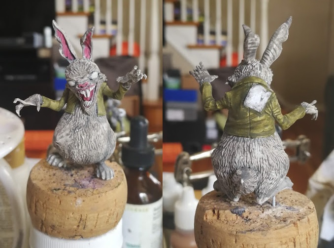
Luther the Pascha Hare 2: From Uneven to Uneasy

So! With introspection and construction out of the way, onto Luther's color scheme.


  • Fur - Undertone Base: FolkArt Barn Wood, Shadow (Wash): Reaper Stormy Grey, Main Base: Heavy Glaze of Reaper HD Ashen Brown, Highlights: Reaper Concrete Grey, then Reaper Misty Grey
  • Jacket -  Shadow (Wash): Reaper Olive Shadow, Main Base: Reaper Worn Olive, Highlight: Reaper Moldy Skin
  • Eyes - Base: Reaper HD Brilliant Red, Shadow (Wash): Reaper HD Rusty Red
  • Inner Ears - Base: Reaper HD Entrail Pink, Shadow (Wash): FolkArt Barn Wood (select areas) 
  • Denim Patch - Base: Ceramacoat Denim Blue, Shadow (Wash): Reaper CCC, Highlight: Reaper HD Military Grey

Re-primed.  The bulge stands out from the fur a bit but I knew a good paint job would help cover up the differences.

Some first coats.  It's funny how the pink in the ear dominates at this stage. Washes and highlights focused on grey tones (not reds) will tamp that down a bit. 

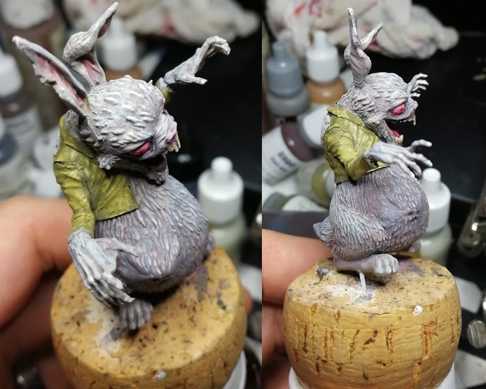
First washes made him look really dirty.

The heavy glaze of ashen brown moves him away from a dirty looking creature to a more rich fur color.  Though at this point the face bulge is clearly standing out from the fur on the figure.

The contrast between the grey-ashen-brown and the concrete grey provided a nice contrast I wasn't expecting.  The concrete grey has a little blue in it.  And normally I avoid mixing a warm and cool tone, but it really helped make this bulge work.

Some final fur highlights and eye work.

Went with a straight denim color for the patch on the back.

There's a some lessons learned on the figure that I would do better if I did him again - mostly green stuff lessons. But the end result fits right in that uneasy place I'd hoped he'd be.

He's freaky enough that I could see him frightening little kids out of a closet door...


Thursday, January 3, 2019

Luther the Pascha Hare 1: The Uncanny Valley Between Comedy and Horror

In college, my American Literature professor taught me that humor was based on "a subject losing his/her pride" in the moment's resolution.  I internalized that theory for many years, thinking humor had the ability to save humanity from its own collective ego.  What I didn't know was this was only the second of three modern theories of humor.  What I knew was the superiority theory.  The other two being relief theory and incongruous juxtaposition theory.

I want to focus on Incongruous Juxtaposition, or as I like to call it: the sudden moment you realized that you perceived the now absurd situation very wrong.

If I had known about the last theory - all my papers in college would have centered around it.  I relate to it like it was a family member.  As I've gotten older, I see modern humor has taken the comedic juxtapositions to more and more absurd extremes, to the point where surreal humor are just older memes now.  Charlie the Unicorn.  It's humor for a world where resolutions comes from places so unexpected, it's bizarre.  Almost anything on adult swim qualifies, but the obvious example is Aqua Teen Hunger Force.

But I've also noticed how the "bizarre unexpected" can quickly swing in the wrong direction. For example, Chad Feldheimer (Brad Pitt) hiding in the closet of Harry Pfarrer (George Clooney) in the Cohen Brother's Burn After Reading.  The set-up feels like a wind-up to a slapstick scene complete with Chad's goofy look when the closet opens.  But any initial laughs are cut short by the sudden violence. Then Harry's concerns over Chad being "a spook" brings back a very nervous humor.  The audience is stuck between laughter and jump-scare fear.

A bizarre resolution can cause a reaction that doesn't make you laugh and teeters on the uncomfortable.  Seeing Pulp Fiction in the theater, I remembered some people laughing when the Gimp came out, while others started to close their eyes and cringe in their seats. There's a great video on the "creeps" by vsauce, that talks about that reaction when we approach the valley between certainty and ambiguity.

It leads me to think there's grey area between comedy and horror: the sudden moment you realize the absurd situation can go two different ways (or in the Coen Brothers case, both at once). Personally I find a use for both.  If humor can teach you to laugh at yourself, horror can prepare you to be unafraid of the unexpected.

I guess this is why I gravitate towards monsters that are more unnerving than obviously dangerous.  Sure, I hold a handful of classic tropes that frightened me as a kid (e.g., werewolves, body snatchers).  But the warped ones that sit on that cusp of "ambiguity" speak to me more.

Which brings me to Luther the Pascha Hare.  He first appeared in Wyrd Chronicles 17 in a short story that was ridiculous, unsettling, and fun.  But it was the cover that grabbed me in the same way that the original Teddy figure grabbed me: a childish figure warped into an absurd terror.  It's frightening but not in a realistic way - like disease, violence or sudden change. He's stuck in between a cartoon and a threat.

The subjectively "fun" part of the story was reading that Luther swallowed people whole, and seeing the handprints pushing from inside his belly on the cover art.  That gave me an idea for his figure...

So on the sculpt... I love the face and the pose, but there's two features that bug me.  First, Luther is wearing a top hat. It's not the character on that front cover.  The second is "the swallowed" inside Luther's belly.  You can see Luther's stomach is angular like something is bumping around inside, but you can't see a face or hands pressing outwards - probably due to the fur detail.  This is probably a compromise the sculptor had to make: the figure needs to visibly have fur but sculpting fur will obscure any impression "the swallowed" makes.

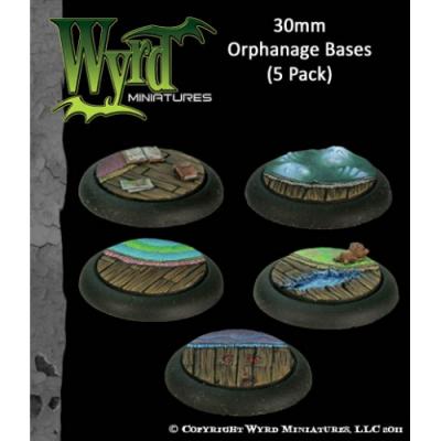
Malifaux made some inserts based on different terrains. One was an orphanage... but clearly a very haunted orphanage. One of them was a ghost coming out of a rug.  I'd already made a copy of this with Instant Mold and green stuff. I could cut out the face and hand pressing up from the rug.


My first run on applying the face of "the swallowed".  I was not going to re-sculpt fur over the face for fear of running into the same conundrum the sculptor probably ran into.  Painting some fur on would be much easier than sculpting it.

Ugh!!  The hat had to go!  The more I looked at it, the more I hated it. Too much comedy, not enough creepy.

Malifaux 2nd edition is known for it's confounding assembly schemes, where tiny important model bits can be mistaken on the sprue for flash to ignore.  So Luther is unusual in that he arrives assembled.  With the hat off I could see why they made this decision.  It looks like the pieces didn't quite line up as smoothly as other builds, and all the gaps culminated in the head piece.

Speaking of gaps, more green stuff was needed on other areas.  I was starting to worry about my face.  It was bulging out so far from the stomach that it was going to need a lot of green stuff to fill gaps and make the folds in the stretched skin look natural.


Sculpting some the scalp and adding a little fur in.

I kept adding green stuff on to make my initial bit of face bulge work.  But eventually I had to admit it wasn't working.  The piece was too thick and to make it work would mean adding so much green stuff it would take over the figure. So I made the decision to take it off and start over.  This time with a thinner piece.  It worked out much better, though sadly some leftover green stuff was stuck on the figure.

This is the only pic I took where I tried to integrate the hand pressing out.  I eventually took it off as I couldn't make the creases and fold look natural so close next to the face bulge. The end result was that area looked a touch rough from left over green stuff residue.

More on the second post...

Thursday, December 27, 2018

2018 Update: there will be more in 2019

For the record, I am not a hobbyist who got overwhelmed by the "new shiny" and faded out on a part-time obsession with painting the small figures.  Reality is I've been painting so much over the last handfuls of months that I've barely had time to write about it.

Well, that and a tendency to overreach.

But I made a commitment that for 2019 that I'm going to turn all those note-scraps of color palettes and half finished musings into a blog entry bi-monthly deadline.

 Looking forward to the first post in a couple days...

Monday, January 9, 2017

Wolf-in-sheep's-clothing: Redeeming a Mini for a Redeemed Misfit

So a few years ago, my family got me Pathfinder's Misfit Monsters Redeemed for X-mas.  I loved the book because it gave a fresh coat of paint a lot of the really "stupid" monsters from old first edition D&D.

One of the "redeemed" that grabbed me with the old Wolf-in-sheep's-clothing (hereon called the WISC).  Old grogs might recognize the monster from the 1e adventure Expedition to Barrier Peaks or maybe the 1e Monster Manual II.  When creating "alien" monsters, it's fine to push the boundaries of weird life forms.  However, here we have a creature from another planet or plane of existence... that looks like a stump (okay)... and grew a tumor out of its head that looks like a rabbit? Or maybe that's its hair, I guess?  Goofiness ensues.  As such, the WISC been roasted many times - my favorite being that it's "a tree stump with a vagina and a weird rabbit sitting on it."  

The Pathfinder update removes the goofy and amps up the alien.  Gone is the fluffy bunny headpiece.  In its place is a "corpse lure". The WISC is intelligent enough to watch its prey's behavior. Then it kills the prey and then props that creature up to use it as a lure, and imitate its motions. When attacking, it has the ability to grapple it's prey and implant eggs inside it - a la facehuggers.  It also has two sets of teeth - the outer set for latching on, the inner set for grinding pieces like a wood-chopper. I really liked the re-write, and it worked well for the campaign I was writing.

Finding a good mini was another issue, though. There was only one existing miniature that existed for this creature from Dark Platypus.  But I really wasn't all that happy with the look or the way the tentacles stuck out.  After my experience with the Hanging Tree, I wanted to see if I could actually make one.

Using Cool Mini or Not's Instant Mold, I copied the teeth set from Reaper's mocking beast and eyebeast (from my original Bones Kickstarter set).

I dremeled out a little hole on a plastic bottlecap and superglued on the mocking beast's teeth.


Next I superglued on the copied eyebeast teeth. After which I realized I needed to expand the shape so his teeth didn't look like they were coming out of the ground. So some more green stuff.  At this point I began to realize this wasn't going to be able to fit on an 1" base.  In game terms, that meant I wasn't looking at a Medium-sized creature but a Large one.

I used an old wood piece from a base I'd cut out previously to secure the top. And (of course) put a little magnet on there in case I ever wanted to mount a creature on it, and have it stay put.


Here you can see some of the gaps I would need to fill in after gluing on the second jaw pieces.


Next step was to fill in those gaps, add the first set of tentacles, and create some root systems for the stump.  In retrospect, I probably should have used green stuff over some wire.  Instead I just used green stuff minus the wire.  

It worked out fine though.  I also made a little indentation on the tentacles to paint eyes on the end.

I primed it grey, and then retro actively decided to add some wood putty to get that bark look.


Another view with more wood putty

Here's the final mini.  I went with a "dead" tree stump tone - rather than a fresher tree stump color palette.  In other words... a lot more grey, less beige.


Of course, the idea of the monster doesn't work without having regular stumps too, so those had to be made.  These have some more "freshly" cut tones.

In my game, the party was heading to a loggers cabin where a bunch of lumberjacks had already cut down some trees. I had the creature already killed one of the loggers out on patrol and managed to pull off the encounter with a little bit of Terror. 


Monday, August 22, 2016

Widow Weaver: Creep Factor 10

So I couldn't wait to parade out my creepy doll crew in a Malifaux game. But my buddy and I ended up using just Henchman so we could get used to the rules more. That meant no Collodi, just Vasilisa, going up against the Ortegas. For those of you not familiar with the game, here's the crib notes: after Teddy died, I hid a lot.

I started looking at some Malifaux models who would fair better on their own and came across the enormously freaky Widow Weaver. After getting my butt handed to me last game, I started assembling her.  She has a teeny tiny jaw piece that bounced out of my hands and I spent 45 minutes crawling around on the floor looking for it. 

A little green stuff to fill the gaps and I got her together.  

Yes, that's a spider faced woman in an 1800's dress.  The style (I think) is 1870's England. She has a bit of drapery on the back, which I found out was called the bustle. It's funny to think of today's obsessions with the female rear end and see it all the way back in Victorian fashion. Still, Widow Weaver doesn't have the Seurat Sunday-in-the-Park, 1890's style, "I'm actually a snail in a dress" bustle.  And thank God for that, because who wants to see a insect lady bounce the junk in her trunk?

A little white paint, a little black wash...

As to color scheme, I liked a light pastel colors on the clothes, XV Legion (and a nice muddy train to boot) did a great job, though I would like her skin to be a deeper purply-black to provide some contrast.

Accents are always a challenge for me. They can make the figure pop or confuse them.  On Widow Weaver its the fan bits, umbrella trim, and the back flower decoration. Some painters made the accent color a bright red, but for me that was too garish. Eventually, I decided on a cool turquoise.  

Color Scheme: 
  • Skin - Reaper Twilight Purple with black washes
  • Eyes - Reaper Bright Red
  • Lower Dress and Umbrella Canopy - Reaper Pink Entrails
  • Upper Dress - FolkArt Bayberry 
  • Wig - Reaper Concrete Grey with Ceramcoat Purple Smoke wash, FolkArt Dove Grey higlights
  • Trim and Umbrella Fringe - FolkArt Camel & Parchment
  • Umbrella Shaft - FolkArt Coffee Bean
  • Accents -  FolkArt Aqua 


Satisfied mostly with the first coat, there were a few things I noticed.  The eyes didn't pop enough. And the skin tone was flat out purple - not purply-black. So she looked more "alien" than "spider lady".

This was one of the first time I use my inks (Privateer Press P3 line). Inks do make a softer transition between the colors, but it's very subtle and unlike a wash, it can't go just everywhere.  I got a look I was pleased with and added her to a base.

I couldn't resist adding the black widow marking on back of the neck like the box. A little freehand work - I had to paint the shape in white first. Ceramcoat Cinnamon, and then outlined in Reaper Mustard Yellow. A little Reaper Bright Red to make the certain bits pop, and then a black wash to blend back into the skin.
Then there was the matter of her base details. I knew I was going to do my Terraclips Cities theme again, but like Sonnia, I wanted to do something different than stray rocks or weeds. One of Widow Weaver's abilities in the lore (and as an upgrade) is to create a Wicked Doll or a Teddy. So I got an idea from some of the smoke ideas I've read about and decided to create a spell effect - like a little doll was being conjured.

I made a little Teddy out of green stuff using a mold I made from an orphanage base.  Then I sprayed some cotton pieces with a mixture of PVA glue and water. The cotton gets really wet so it's important to play with it and get a little separation between the fibers.

I thought I got the wisps to curl up enough like a magic spell smoke had just gone off.  After affixing the both pieces to the base, I gently applied some Superglue on the cotton-smoke to harden it more. 

I showed my wife what I'd done and she looked at the white smoke cloud and said, "Is that supposed to be a cradle?" So I decided the cloud needed some more "wispy bits" going on.

Every time I take a picture of what I thought was final, I'd find some bit that was off. On this model, it was the beaded hem. Freakin' beads, they were so tiny black wash just made everything black, and white drybrushing made everything a stream of white. But I wouldn't see it until I took a picture. I'd get the lighting right take a snap, and find a spot that had too much wash. Or too little. Or no definition. Or plain ole sloppy.  GAH!

So I think these are the final shots.

Monday, August 1, 2016

Sonnia Criid 1: Sly and fiery

One very l lucky gift I got was a slew of Guild miniatures (thanks to my nephew Josh), including Sonnia Criid and her crews in metal.  I had to recreate her left leg under her coat with some greenstuff (simple thanks to my Instant Mold) and her cigarette was missing. But otherwise, she was in really good condition.

Primed white, black wash and thought about the color scheme for everything except the coat.  I've seen Sonnia with blond hair and black hair, but I really couldn't picture without red hair.  My goal here: I also got the Sonnia Avatar with her, so I wanted to paint the two Sonnia figures simultaneously.  So the color scheme challenge here was to get a scheme that would work with a yellow glow I'm expecting for Object Source Lighting (OSL) on the avatar version.   

Coat color was my big challenge.  The lapel needed to be the same color as the inside of the coat seen at the bottom.  I was going to avoid the classic color when I found a two tone coat color that I liked.  This would reflect the OSL glow in the other model and I was convinced classic Sonnia color scheme (reference) worked.  So - classic scheme it was.  I set out for the pallette.

Coat 
Vallejo Heavy Brown - main
Reaper HD Golden Brown - undershadow wash
FolkArt Walnut Brown - wash
Reaper HD Desert Tan - 1st highlight
Reaper Yellow Ochre - 2nd brighter highlight 

Hair
Reaper HD Sunburn Flesh - main red color
Cinnamon (Reaper Ruddy Brown) - wash
Reaper HD Woodland Brown - 1st highlights
Reaper Rosy shadow - 2nd highlight

Jeans 
Reaper HD ash grey - main
Dark Grey - wash
FolkArt Cobalt Blue - undershadow

Shirt 
FolkArt Parchment - main
FolkArt Light Medium Grey - Wash
Reaper HD Concrete Grey - undershadow wash

Cuffs
Reaper Bloodless Skin - main
Reaper Moldy Skin - wash
Reaper HD Ashen Brown - undershadow wash

Started with the eyes - and I felt like for a moment I was looking at ScarJo.


The first coat she really started to come together.  I was really happy.
And... then.. 
And... then.. 
I had to go and screw around with the eyes. Why?  Why did I screw with my number one rule? Because I saw this article from the hyper talented Marike Reimer and thought "Hey a tiny dot of white will give that eye some shine!"  Instead, I messed it right the hell up.  So I had to repaint the right eye white and outline black.  But now the eye on the right was way too big.  I just couldn't get it fixed.


 Eventually I figured out that the black had gone past the eyeline and onto the face and toward the ear.  So I had to work the face color from the hairline in until it looked right. It may sound obvious now, but at the time, it felt like a miracle that I figured it out on my own.


I used a non-metallic metal (NMM) technique for the sword and chains. Did anyone ever state how much of a pain in the ass NMM on chains are?  It's a ton of work trying to get a little metallic shine on every stupid chain link.  

Anyway I went for fire theme on the sword details which you'll see in later pictures using Reaper HD paints. Mounted her on base using my Terraclips Cities pallette.  Also managed to spill super glue all over that right leg, so it was unnaturally shiny. 

I've done this before and the solution is Testor's Dullcote.  Had to learn the hard way on that.

So far, very pleased. Now I needed to focus on some other details.  The classic Sonnia picture has her holding a cigarette in her fingers, but it broke off the mini along with her left foot apparently. I tried to glue a new one back on, but one small bump and it broke off.  Being that I wanted to use this mini in games, that wasn't going to work.  I had to start thinking out of the box. It seemed logical that she would be holding a soulstone. So with a reference or two of its bluish glow, a soulstone would be where the cigarette once was.


While fixing the soulstone, I started thinking about what to put on the base. There was the usual standbys of weeds and stray stones, when I wished I could bring the fire theme to the base like the Avatar. Then I remembered I used this technique I'd read online to create smoke puffs fron Q-tips. 

And I just so happened to have some leftover "smoke" from some shadow figures I'd been working on. 

Picked one I liked. Ceramcoat Purple Smoke with some Ceramcoat Cinnamon with touched of Reaper Ruddy Brown and Burning Orange on the underside.


Suddenly a look fell into place: Sonnia has just finished crushing a soulstone to burn something up, and she cockily looks to the side as the ignited item snuffs out. 

Here's a shot with it mounted where you can see the soulstone.


And here's one from the backside.  Better pictures to follow with a better camera soon.