Eager to geek-out but clearly side-lined, I meandered back to person who'd invited me. A handful of other "no room at the inn" gamers had also gathered around him. So he suggested we play Puerto Rico by Rio Grande Games.
It had been the first time I'd enjoyed a game that wasn't either an RPG or one of the pixelated variety. I bought my own copy, introduced it to my family, and found myself re-invigorated with a gaming revolution that happened under my nose: a resurgence of great board games.
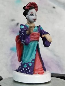
My wife recently picked up Tokaido - a competitive game to see who can vacation the hardest. She'd grabbed an expansion and got a bonus figure: Sasayakko, the geisha.
Hinamatsu was in my "to be painted" queue so I decided whatever color scheme my wife chose is what Hinamatsu would be getting as well.
My wife wasn't thrilled with the style and palette of the Sasayakko box art (what I dubbed "super-lavender"). I was relieved as trying to figure out how to paint a tiger that small would have been a challenge. So we circled through several geisha pictures until she chose a stock photo.

- Skin - Main Base: Mix of Reaper Tusk Ivory and Tanned Skin Highlight, Highlights: Tanned Skin Highlight, Shadow (Wash): FolkArt Barn Wood
- Oshiroi face paint - Main Base: Mix ofVallejo Heavy Heavy Warmgrey, Vallejo Ghost Grey, Dash of Reaper Tanned Highlight
- Eyebrows - Thin Glaze of FolkArt Autumn Leaves, then a Thin Glaze of Cinnamon (thin glaze); Touch up with FolkArt Autumn Leaves (thin glaze)
- Undersash and Belt - Undercoat Base: Mix FolkArt Autumn Leaves and Reaper HD Entrail Pink, Shadow (Wash): Cinnamon around edges, Base: Heavy Glaze of Reaper HD Entrail Pink Highlights: Reaper HD Entrail Pink mixed with Apple Barrel Antique White
- Back Undergarment - Base: Thin Glazes of Reaper HD Solid Blue
- Main Dress - Base: FolkArt Aqua Wash, Shadow (Wash): Reaper HD Solid Blue , Highlights: FolkArt Aqua Wash mixed with Apple Barrel Antique White
- "Waves" in Main Dress - Base: FolkArt Buttercup, Shadow (Wash): FolkArt Ochre Yellow, Highlights: Vallejo Ghost White
- Arm Drapes - Base: Reaper HD Twighlight Purple, Transitions: FolkArt Night Sky (glaze at top) to Reaper HD Gem Purple to Mix of Reaper HD Gem Purple and Apple Barrel Antique White
The eyes are always the toughest to do, so I've learned to start there. Experience has taught me to not get hung up on how war-like a figure will look in this stage, because filling in the face will soften all the "dirty tricks" to get them done.

Knowing very little about Japanese history and culture, I did a little research into the white face that the geisha strive to have. It's appararently called kabuki make-up oshiroi (白粉), and it's also also what Kabuki players use.

Applications of base coats done . Here I managed to get the little white dot in the eye that drove me crazy when I was trying to paint Sonnia.

First Glazes on Sash and layer 1 dress. Originally started with Cinnamon on headpiece, but over time I realized gold would be a nice contrast.
Eyebrows were important here as most oshiroi I googled had this orange red style.

Most painting techniques for black hair tend to encourage you to start with a base coat of black and then highlight the tops of the hair charcoal grey - working up to a dove white for any strands that might gleam. In the past I've done a heavy glaze of charcoal grey first and then heavy wash of black. I also work dark blue in the undershadow where a gleam might pop out.

The moons and the arm drapes were just balls at this point.
On the "globes", when you have to paint an exact shape like a perfect circle or a moon sliver, it's really challenging to make it look right at this small a level. I've found it's easier to paint a simple shape and paint out the unnecessary stuff with the color of the background... than try to paint the shape itself.
Next up to paint was the blue and yellow "swatches" (I'm calling them this because they have a very "80's" shape and look to them. Problem is they had no pop...

...and the key to give the pop was to outline with Antique White.

Final touches didn't do much. Nuln Oil on Gold - not much of an effect. Ran a little dark grey wash on the recesses. I wanted to dull the recesses to produce a more realistic look. But for some areas it just looked a little more dirty.
Lessons learned - I should have focused more on highlighting creases and mixing the original color for the washes to make the shadows blend better.

