Showing posts with label miniature painting. Show all posts

Thursday, November 21, 2019

Mysterious Effigy: It's Own Creepy Thing

My buddies and I were talking about what influenced early D&D.  Aside from the well-documented progression out of wargaming (i.e., Chainmail), I'd always assumed it drew from Tolkien.  It's easy to trace the creative leap from playing out big battles into a deeper but smaller skirmish with the key leaders a la Lord of the Rings's Fellowship.  Thus much of the Tolkien-esque fantasy tropes littered through 1e D&D: humans, elves, dwarves, rangers, wizards and quests.

And of course, don't forget the hobbits halflings.

But I'm wrong in thinking it's all JRR.  An old article was dug up where co-creator Gary Gygax firmly put his foot down that Tolkien was far from the sole inspiration.  He waxes poetic about the different fantasy writers with a causal nod to mythology -- promoting that D&D is more akin to multiple other heroic fantasies than just one source.

Ruminating in the article, my JRR position was blindly reductive.  Flaming swords and thrown hammers that return to youThe Minotaur and The Golem. Carpet of Flying. Baba Yaga's Hut. The pop-culturized Monk. Wishes. Dungeonland (!). The breadth of references is obvious.

But what D&D became is more than just a collection of multiple mythos, fairy tales, and pulpy medieval tropes.  In the creative process of including everything, you also end up making something new:
  1. a place where it all exists
  2. original creatures that live among known references
And as much as I am fascinated with the world of the collective, I have a special place in my heart for the original things - the new creations that become the short hand for the big picture.

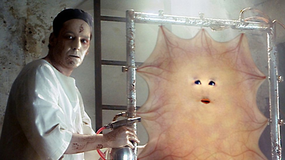
This leads me to the Mysterious Effigy... 

The 1e sculpt was clearly just an effigy.

The 2e sculpt is less so.  You could set the 1e version on fire at a protest.  Not so much with the updated version.

At first blush, it appears to be leaning in on the Neverborn mimic aesthetic -- with the mask coming off like the changeling...

... Except it has spider legs. So I thought this might be reference to Arachne. Or maybe a re-interpreted drider.

... Except it doesn't have spider eyes nor human eyes. It has a nightmarish sideways human eyes.

So the Mysterious Effigy - much like the mimics and the wolf-in-sheep's-clothing - is it's own thing.

As to painting it, I originally wanted to imitate a dress pattern I saw Adam Huenecke had done on Molly.  But the Mysterious Effigy sculpt is a lot busier and a lot smaller, and I decided the floral pattern wouldn't work.

Eventually I decided on a yellow dress with a simple square pattern from 1827.


Mysterious Effigy Scheme
  • Skin - Wood Lines: FolkArt Walnut Brown, Undertone Base: Reaper HD Ashen Brown, Shadow (Wash): Dusky Skin, Main Base: Heavy Glaze of FolkArt Mushroom and Barn Wood, Highlights:
  • Dress - Undertone Base: Tanned Skin, Main Base: Heavy Glaze of FolkArt Ochre Yellow, Shadow (Wash): Tanned Skin, Highlights: FolkArt Sunflower and ButterCup
  • Arm Cuffs - Base: Apple Barrel Antique White, Shadow (Wash): Vallejo Khaki, Highlights: Reaper Misty Grey
  • Eyes - Base: Apple Barrel Antique White, Shadow (Wash): Cinnamon, Highlights: Reaper HD Entrail Pink, Outlining (wash): Black and Reaper Dusky Skin, Gleam Highlight: White
  • Knife - Base: Vallejo Cold Grey, Shadow (Wash): Vallejo Black, Highlights: Reaper Misty Grey
  • HairBase: Reaper HD Military Grey, Shadow (Wash): Black, Highlights: Reaper Grey Triad
  • Masks - Undertone Base: Ceramcoat Blue Heaven, Base: Reaper Fair Skin, Shadow (Wash): Reaper Tanned Skin, Highlights: Reaper Fair Highlight
  • TeethBase: Vallejo Khaki, Apple Barrel Antique White, FolkArt Parchment

Getting the base right to look like the Terraclips Building Floors.


First a white prime and some glue work after I snapped off the arm holding the mask (&?@!*!)


First Coats


Eyes - Base: Apple Barrel Antique White, Shadow (Wash): Cinnamon, Highlights: Reaper HD Entrail Pink


Outlining (wash): Black and Reaper Dusky Skin, Skin clean up where Dusky Skin was too dark: FolkArt Barn Wood,  Gleam Highlight: White


There's a process I go through when doing patterns.
I got the upper part of the dress down fast enough that I got a little cocky.


What follows next are moments when you realize you did it right...


...when you realize you did it totally wrong...

...and ones where you start and then lose confidence mid-way through that it's going in the right direction.

References always help back up when you are second-guessing.  A simple google of checkered drapes gave me a great reference of where lines are supposed to go when a hem is pinched on the ends.

But the biggest lessons learned... When painting lines on a yellow base color, first draw it out in a lighter color that the final darker color. I would get a line down in a dark brown (Reaper Dark Skin) then realize it was off and have to use multiple layers of Ochre Yellow to undo it. 

Eventually I decided to use Reaper HD Concrete Grey to ease any mistakes. 


And holy smack, did using that color make this fix simpler.  Or at least it boosted my confidence in drawing in the horizontal lines to finish the cross patterns.  There were very few fixes at this point.

Some light skin tone glazes on the masks and I was left with a super creepy mini that I felt rewarded with spending the extra time to nail the smaller details.

Thursday, October 31, 2019

The Carver, part 2 & 3

So for Halloween this year, I'm going to finally post two older entries I started several autumns ago on some of my favorite figures... Pumpkinheaded scarecrows.

First up is Malifuax's The Carver.  I started this entry back when I discovered the triple prime threat of grey primer / black wash / white drybrush.

The Carver became a centerpiece for pumpkin patch terrain I used in a Pathfinder campaign I ran.  The Carver and other pumkpin based scarecrows all got used as Jack-o'-Lanterns - which turned out to be formidable foes for the early levels.  I nearly wiped out the party.  Good times.

As to painting, I didn't take a lot of pics for my 1st coats, so I'm going to show most of the end results.

The Carver Color Scheme
  • Pumpkin Head Base: Reaper HD Fireball Orange, Shadow (Wash): Reaper HD Burning Orange, Highlights: Reaper HD Golden Yellow, and Saffron Yellow 
  • ShirtBase: Apple Barrel Antique White; Shadow (Wash): FolkArt Light Grey; Highlights: FolkArt Parchment
  • Pants -  Main Base: Heavy Glaze of Delta Ceramcoat Denim Jeans Blue; Shadow (Wash): FolkArt Thunder Blue, Highlights: Light Glaze of Delta Ceramcoat Sky Blue
  • Flannel Patch - Base: Delta Ceramcoat Cinnamon, Dark lines: FolkArt Charcoal Grey, Highlights: Pink
  • Wood -  Base: FolkArt Coffee Bean, Shadow (Wash): FolkArt Walnut Brown
  • Straw -  Base: FolkArt Honeycomb, Shadow (Wash): FolkArt Walnut Brown, Highlights: Reaper HD Mustard Yellow and HD Pale Saffron
  • CrowsBase: Charcoal Black , Shadow (Wash): Black, Beaks: FolkArt Ochre Yellow and Reaper HD Pale Saffron Yellow
  • Stitching and Wraps - Base: FolkArt Butter Pecan, Shadow (Wash): FolkArt Walnut Brown
This was one of the first times I got to break out my Reaper HD paints I'd gotten as an ace gift from one of my gaming friends.  All the oranges and yellows all went to painting that awesome pumpkin head.  One challenge I had with Reaper's HD yelllow paints - and I've heard reiterated elsewhere - is the paints separate in the bottle easy and require a lot of shaking.

While I went for sort of common farmer white shirt, I really wanted to get a plaid flannel look on the patches.  So here comes the dreaded lines painting.  Actually, I feel like I'm getting pretty good at this.  And I dread this a lot less than polka dots.


I wanted the Carver to look like he's stepping out of the fields and just started the journey towards town.  So for his base, I gave it two sections - one with the dirt and mud of the pumpkin patch, and one where the town's cobblestone begins.  I also wanted the cobblestone path to have an overgrown, not-used-often look - like the urban faded into the rural.  So there will be more patches of earth in between the bricks than I normally do.

Here's the finished base. I used my canned Terraclips Street color scheme on the cobblestone. I used a deep rich brown with a little red hue for the surrounding earth, knowing that static grass would probably go over it. I wanted to distinguish the two earth tones so I made the "crops" side of the earth a little more muddy - like a wet grey brown. Some general Walnut brown washes separate everything up nicely. 

FINAL THOUGHTS:  Overall happy with the final figure.  The snapped scarecrow post is a fun detail and adds a little bit of drama to the figure -- like he's gotten loose and bringing the terror to the city.

On the denim, this is one of the few times where less is more.  I've looked at several tutorials that give about 5-6 steps to getting a good denim look.  And when I look at what I did here, I don't see much of a difference.  

In retrospect, I could have made him a little dirtier looking.  And I've learned a bit about darkening a figure up to get a good glow since painting him.  If I were to redo the figure again, I would definitely take a more OSL approach with him.  


Thursday, September 12, 2019

Neverborn Skin Tones

Painting a demon seems kind of boring to me.  Sure, when I was a kid, Chernabog was ominous in Fantasia. But fantasy lines are so rife with this BBG that I now find them commonplace, much less scary.  Red skin, big horns, goat's legs, Tim Curry's voice.  Next please...

So I avoided picking up Nephilim figures from Wyrd's Malifaux line.  It was too in the vein of what I was avoiding.  I thought the nightmares from Malifaux captured my imagination more.

But my "to be painted" collection started growing bunches of these Nephilim: Nekima. Tuco. Angel Eyes. The Scion of Black Blood. The Bloodwretches.  Stuck with them, I struggled on what to use for skin tones.  Especially since each of them have a slightly different background.

So to start, I picked the most unusual part of the their biology: Black Blood.  So what would a creature that had "black blood" look like?  The closest real "Earther" counterpart creatures with purple or violet blood.   Of these the most interesting palette I saw was this picture of the sipuncula or peanut worm.  The creature is interesting because different parts have different palettes based on how the camera captured its translucence.

Having recently picked up the 2nd Edition Core Through the Breach book, I got to read up a little on the history of Malifaux.  The planet starts off with human-like people.  Eventually they got to war with their greatest enemies - the Tyrants.  To defeat them, they turn their blood black - basically a defense mechanism similar to the Alien Xenomorphs.

The lore also talks about a ritual to turn a human into a Neverborn.  From some of the stories I've read, you can tell when someone doesn't look like an indigenous Neverborn who had existed in Malifaux before the Breach opened.  As such, a transformed human can still disguise him or herself a little among other humans.

So I'm classifying them as three types of creatures: Indigenous, Once Human, Mid-Transformation.

One thing I learned from painting the warpigs: A simple two-tone color scheme can have unexpected depth by using a a deeper or darker undercoat and then a heavy glaze of a lighter color for the base coat.  Here the shadow is a third color on the undersides of the model. Final highlighting would be a white skin tone that had little-to-no red in it - probably a linen, recalling the Jen Haley tutorials.
So terms I'm using for this process are: Undercoat, Shadow (Wash), Base (Heavy Glaze).

One specific thing regarding the term "undercoat": I'm still priming white, uniform grey, or black - and THEN applying what I'm calling "undercoat".  (I recognize a prime coat is technically an undercoat, but whatever...)

So I'm breaking out skin tones in three sections:
  • Indigenous (e.g., Nekima and the Scion) would have a more blue/purple skin tone than a human one.  The males have a deeper purple undercoat - Reaper HD Twilight Purple.  The females slightly brighter purple - Reaper HD Gem Purple.  Base coats will be straight Linen color.  No fleshtones - like Caucasian.
  • Once Human (e.g., Tuco and Angel Eyes) may still retain a little of the human skin tone.  Reapers Dusky Skin tone might work as a undercoat base with an base of the Reaper Caucasian fleshtones, with final highlights being Linen.
  • Mid-Transformation (e.g. Bloodwretches) would still retain more of that Caucasian skin tone with blends in the Once Human in the extremities - similar to the Swine-Cursed.

Saturday, September 7, 2019

Warpigs: Gathered in their Marshes...

Painting pigs usually always means "pink".  The whole pig - painted pink.  But looking at various pics of pigs - while they have a pink or "pinkish" skin - there's a fine white fur that makes the pink more fleshtone.

So taking the lessons learned from the Swine Cursed - this calls for undercoating and glazes.

Warpig Color Scheme
  • Main Skin - Undercoat: Reaper Maiden Flesh mixed with Reaper HD Entrail Pink, Base Coat: Heavy Glaze of Reaper HD Fair Skin Shadow and Reaper HD Maiden Flesh, Highlights: Thin Glazes of Reaper HD Caucasian Flesh, Reaper Maiden Flesh, and FolkArt Linen
  • Hooves - Base: FolkArt Butter Pecan with dark brown washes (FolkArt Walnut Brown)
  • Eyes - Base: Reaper HD Bright Red
  • Fur - Autumn Brown with Reaper HD Golden Brown highlights

Having played a game or two running the Ulix and his pig crew, I realized I needed two warpigs for some heavy hitters.  At the time I bought the figure Malifaux only had one sculpt.  Since there's no variance in the sculpt itself, I needed to be able to distinguish the one from the other.  (It makes a huge difference in preventing mistakes mid-game.)

So I decided one pig would NOT have the pre-packaged gremlin with banjo riding him.  The other would.

Warpig 1 had the rider.  Primed white and black wash for separation.

First coat was all pink.  He really looks like a hot dog here.


With the first glaze of fleshtone you can already see the more natural pig skin color. I didn't take good notes here, but I think I used a warmer skin color with the first pig - like Fair Skin Shadow or Tanned Skin.


Another snap after more highlighting.

Warpig 2 needed to have all traces of the gremlin rider removed.  Some Dremel work handled that nicely.  Of course afterwards meant some green stuff work.

Primed and separated below.  I was pleased with how well my green stuff work came out.

I missed taking a snap of the undercoating of pink for Warpig 2.  But below you can see the first heavy glaze.

Putting him on a nice muddy base. 

Final Thoughts:
Very very happy with running an undercoat for painting pig skin tone.  Big success. 

Wish I could remember specifically was I used for Warpig 1 on the first heavy glaze (Reaper Fair Skin? Fair Skin Shadow? Tanned Skin?).  The yellow in the color makes an obvious difference in the tone below.  Warpig 2 looks a little cold in comparison.

Also I could have used a dark brown for separation on the ears rather than black wash.  Separation on the ears and tusks look a little harsh. Still table top ready!


Saturday, August 3, 2019

Doppleganger: Fear of the Imitator

This is a sharp left turn from my previous post on dogs, but it has a happy ending.  So hang in with me on this.

Last month, I was dreaming that my puppy was acting strange - almost feral - whenever she was in my peripheral vision.

A vet came to our house and said, "This is not your dog.  It's an imitation.  Right now, the imitator has taken a hold of your dog and she's like a zombie version of her former self.  The only way to get her back is to kill the thing you see before you." 

And he handed me a rock.

I braced myself, sighed, and swung the rock at her head. The blow didn't finish the job. She looked up at me, like she does in the photos my wife takes when she's at her cutest with big pleading eyes.  Except now the side of her skull was lopsided and blood was pouring out of her nose and mouth.

I dispassionately swung the rock again - as if I were performing a task.

And then I woke up... horrified at the dream but moreso at myself.  What the hell was wrong with me?  (And no, I hadn't re-watched The Thing the night before.)

My worst nightmares are always about the imitator.  

And my worst recurring nightmare is right out of "Invasion of the Body Snatchers": someone has clearly been replaced by a copy.  More people start acting strange and I become concerned. Then, everyone I confide in tells me to stop worrying... and here, eat this strange food I've never seen before.  Or drink this cup of milk with a thick mist rolling off the brim.  Or just step in this shadowed back room and relax. Or just close your eyes - we have a surprise for you (no peeking).

I had a string of nightmares like this almost every night during my first trip to Ireland.

I recognize these nightmares are rooted around change and fear of it.  I used to think it was based around the fear that those around you have flipped their moral positions.  Or everyone has started buying into some new hip philosophy that is terribly flawed, one that seeks my own death in a way that everyone else is steadfastly ignorant of.   

While these might be the root for some, I've figured out my nightmares stem from the opposite: I have changed -- or had to change -- and my psyche is straining to catch up.

The first time I pieced it together was all those years ago in Ireland.  During the trip, I became enchanted with the land, the viridity, the people, the stout. Then, the doppelganger nightmares every night. After one rather awful nightmare, I awoke with the clarity that the one who was changing was me, not my surroundings: I had adopted a slight brogue. So I forced myself to stop speaking with the lilt I was so charmed by (and cease what was probably an embarrassing cultural appropriation). I reaffirmed to myself I was a Northeastern American on travel.

The nightmares stopped.

My most recent imitator nightmare definitely revolved around the death of our previous dog, Ammi, and the transition to our new dog.   Ammi's passing left behind a void in our household, and we were lucky to locate a dog that filled it so perfectly.  But I was still struggling with moving on; it was harder on me than I wanted to admit to myself. And my kill-the-fake-puppy nightmare manifested from my lingering numbness, fresh emotional confusion and guilt. 

Numbness over the constant clean up as Ammi slowly lost control of her body and more of her personality. 

Confusion over caring so deeply for a new dog when I still cared so deeply for Ammi.

Guilt over "replacing" her, probably sooner than I was ready to admit to myself. 

Things changed but I was struggling to keep up.   But like most fears, once faced into light, the nightmares dissipate.  Once I realized the root of the issue, I came to peace with the situation.  The nightmares stopped.

So... before I move onto to facing the paint job, I want to clarify a few things

First, Spelling: Malifaux spells their creature doppleganger rather than doppelganger, which comes from the German doppelgänger.

Second, the creature definitely draws for the D&D-ish interpretation of doppelganger - a monster who has supernatural powers to imitate a person - rather than the more innocuous "twin stranger".

Third: the figure itself.  The Malifaux Doppleganger figure can be painted two ways: one as if she's holding a towel, one as if she's grabbing a newly acquired sheet of skin to be added to complete her/its masquerade.  

I've seen many done as a towel, so I chose the latter. The sheet of skin needed something to define it a bit. My inspiration to use veins was Cassandra from the first season of the rebooted Dr. Who series.

Doppleganger Color Scheme
  • Skin - Main Base: Heavy Glaze of Reaper Tanned Highlight, Shadow (Wash): Reaper Tanned Skin, Highlights: Reaper Fair Skin
  • Muscular Bits -  Main Base: Reaper HD Brilliant RedShadow (Wash): Delta Ceramcoat Cinnamon, Highlights: Reaper HD Entrail Pink
  • Hair - Base: Thinned Vallejo Black, Shadow (Wash): Vallejo Black
  • Red and Blue Veins - Undertone Base: Reaper HD Brilliant Red and FolkArt Solid Blue, Shadow (Wash): Heavy Glaze of Reaper Tanned Highlight
  • Viscera - Base: Tamirya Tamiya Clear Red paint, Uhu glue, Vallejo Black (see post from chestofcolors.com)

So I used my standard procedure for painting eyes - which i have learned is to do the eye first.  Disappointingly, the awesome The Craft forums on reapermini.com where I got this idea from has now been taken down.  You can still see ghost references for this method on pinterest.

Anyway, the concept is paint the white of the eye.  Then paint a black dot for the pupil. If you screw up, it's easy to fix because you just start from white again without screwing up a perfectly painted face. 

Then paint everything around the eye in black, slowly making sure you don't nick the white of the eye.  Then paint you skin base coats on the face.

For this figure, I got a deceptively coy, almost anime-like big-eyed expression on the figure.  I was very happy at this point.

Dripping blood would definitely distinguish a sheet of skin from a towel. So I tried a new method I read about from chest of colors. The idea is to make a sticky red "goop" that you pull between areas to get the stringiness of fresh blood.  

Dropped a big wad of the goop and pulled it up to the sheet.  For a first time, I was really proud. Beaming, I showed this off to my wife - who said this looked more like... something else... was shooting from between her legs than it did the sheet dripping.  

Very embarrassed , I took an exacto knife and cut off most of the dried goop. Then applied a method that I've seen for drool that uses fishing line and super glue.  That got a coat of Tamirya Red.  

Big improvement.


In retrospect, this figure would have looked a lot better if I'd done a reddish skin tone as an undercoat, then done the veins and then a heavy glaze work of the base skin tone.


Wednesday, July 31, 2019

Trees and Contrast Paints

If not obvious already, I love using terrain in a wargame and RPGs with miniatures.

But I didn't always have this appreciation. Most RPG's I played in the 80's and 90's used "theater of the mind" to visualize spaces. This style of play relies on the game master to communicate the placement of all the relevant pieces in an encounter.  (Map drawing helps too.) 

But after having played with a group who frequently uses terrain and miniatures, there's an immersive experience that prevents me from going back to the theater of the mind.

Mini painting soon became a creative outlet - as I wanted to re-create the same environment my gaming group had. 

Then it became an addiction.  Seeing a unique figure plants the seeds of encounters and adventures. It even forces you to pick up more mundane objects.  I'd purchase figures I might not use, but looked too cool to pass by.

Then it became a storage concern with the advent of Kickstarter and the board game revolution.  Decent unpainted plastic minis came cheap.

And now, I'm reflecting on all this hobby consumerism gone wild.  I'm refocusing on its personal importance and artistic value. 

It's also partially because I inherited a small terrain legacy.

I had a friend who I knew to be a gamer. We'd chat about figures we picked up, but where I was focused on grabbing one or two figures - sweating over which highlight to use - he went the pre-painted miniature route. Then pre-painted terrain.  That eventually became 3D-printed terrain.  His mission was to create the ultimate campaign.  Four 3D printers ran non-stop making houses, towers and trees.

But he passed away before he got to run his ultimate campaign.

His family was looking to clear out his home. No one - not even gaming stores - wanted his unpainted 3D-printed stuff.  I grabbed all of it before they hit the curb.

Conflicting feelings car-crashed in me:
  • Responsibility - I cannot let my friend's work go unnoticed or unlived.  There's a unrealized dream behind every tree he printed. 
  • Panic  - There's not enough time and space to paint all his stuff, much less complete my own surplus. 
While I have come to terms that I have some auction-purging to do, I will note that Games Workshop's Contrast Paints came at just the right time.  The "one coat and done" has a great appeal to knock out some of my new acquisitions.

And since I had a lot of new trees, it was time to start there.

First - white primer.

For my First Trial, I used five colors from the Citadel Contrast paint line. These colors are dark to light and I used them from bottom-to-top: Dark Angels Green, Camo Green, Ork Flesh, Militarium Green, Plauguebearer Flesh.

Realizing that these paints are very thin, I heavy-loaded the brush to be able to move the paint around on the figure to do some wet-blending.  But starting from the bottom up, the paint was constantly dripping down and collecting under the tree and running on to the trunk.


With washes, you can mop off the run-off with a clean brush. But with Contrast Paint this made smears everywhere.  The only chance to really save other areas that get spilled onto is to catch the paint before is slides into the area - which defeats the purpose of saving time.

So I learned something very important with Contrast Paints:
  1. make sure any wet blending is done above an unpainted area so you paint over with white or grey again
  2. most importantly - start from the top down

So here we go top down starting with Plauguebearer Flesh...

... then Ork Flesh...

... some wet Blending more Plauguebearer Flesh in with Ork Flesh...

... Militarium Green as a wash for top area...


... then Creed Camo to transition into darker areas...


... and finally Dark Angels Green with no run-off!

So far, very good.  Onto Bark work. (We will not use brown.) I have three examples.  One starting with Grey Primer with Skeleton Horde.

Another using White primer with Basilicanum Grey. 

Finally, White Primer with a quick base coat of FolkArt Barn Wood and then Basilicanum Grey 

Final part bases.  Old bright brown - Delta Ceramcoat Autumn Brown with a Contrast paint Cygor Brown


Final trees before adding any flock on the base.
Grey Primed (probably my favorite).

White Primed with no basecoat on the bark. Has almost a birch look to it.

White Primed with Barn Wood basecoat on the bark.  The not-quite-done print job on this showed a lot of lines on sculpt. 


Overall this is an expensive way to paint this.  But the speed combined with detailed look is just what I need to get things done!