Tuesday, December 31, 2019

Freikorps Librarian: Revisiting the Ochre Palette

What to do with the Freikorps Librarian? She is one of the more interesting figures and I happened to nab a first edition model off ebay.

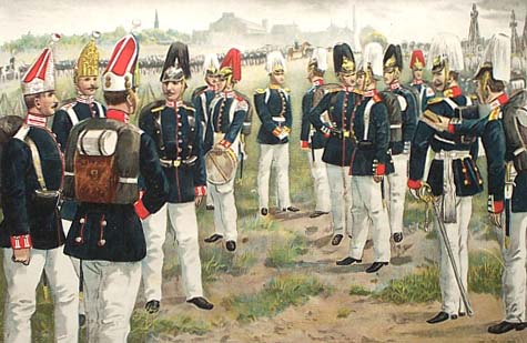
Overall, I love playing the Malifaux Freikorps on the table, but the minis tend to give way to an obvious militant drab green palette a la camouflage.  It's... fine... but for near turn of the 20th century, it's still a little early to be jumping into the WWI style.  And the navy blues of the Prussian military around that time seem very flat to me.  The suits should be made of leather but I wanted to do something different than the reddish-brown Cinnamon style that I overused in my early painting days.

That leaves me with something brown, and straight brown is very bland.  So I wanted to breathe a little life in to an ochre palette:
  • Reaper Military Grey
  • Reaper Dark Skin / FolkArt Cafe Latte
  • FolkArt English Mustard / Yellow Ochre
  • Apple Barrel Antique White
I added a few others into the palette 
  • FolkArt Butter Pecan
  • FolkArt Linen for Highlights
The main color triad focused on Reaper HD Military Grey, FolkArt Butter Pecan, and FolkArt English Mustard / Yellow Ochre.

So I knew where to start.  But where to go afterwards was a matter of "let's see when we get there."

To start I used grey primer, black wash and white drybrush.


First coats of Reaper HD Military Blue on the clothing, Butter Pecan on the leather padding, Yellow Ochre on the boots and book binding.


First washes.


First run on highlights 

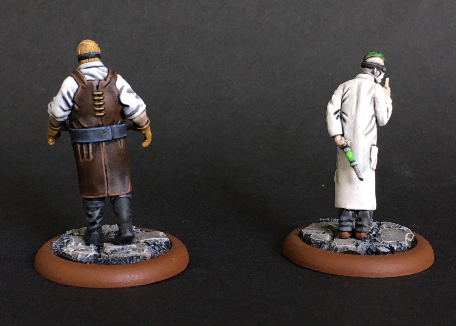
Mixed Military Grey with FolkArt French Blue in dark to light tones for highlights. Vallejo Cold Grey on the metal parts with some Citadel Nuln Oil for separation. To "leather up" the shoulder pads and breast areas (originally in FolkArt Butter Pecan), I put my first trial of Citadel Contrast Paints - Skeleton Horde. But not all over just nearest the creases.

Parchment on the book pages.  Heavy glaze of Reaper Military Grey on front side of legs to blend highlights a little.  Nuln Oil on the dagger and for some separation.  Highlights with Parchment on the whiter leather bits (not as visible in picture as angle of photo is slightly bottom up).


At this point, while I was happy with the general color scheme, I had the ribbons and the goggles to go.  The ribbon I decided to run counterpoint with the set scheme and use an accent color of Red to make the figure pop a little. Reaper HD Brilliant Red, Delta Cinnamon, and highlights mix of Billiant Red and Antique White.

The goggles took more fretting because I had to decide whether to show the eyes (which would have been very difficult given the size) or try a reflection like it was glass. I chose the glass option.  

Cobalt Blue wash 
Vallejo Turquoise
Dot of a mix of Vallejo Turquoise and French Blue 

Touch up goggles English Mustard and Antique White


This ended up being my color scheme.

  • Clothes - Main Base: Heavy Glaze of Reaper HD Military Grey,  Shadow (Wash): FolkArt Cobalt Blue, Highlights: Mix of Military Grey with FolkArt French Blue 
  • Padded Leather  Main Base: Heavy Glaze of FolkArt Butter Pecan, Shadow (Selective Wash): Citadel Contrast Paint Skeleton Horde, Highlight 1: FolkArt Linen; Highlight 2: FolkArt Linen  and FolkArt Parchment
  • Shoe - Base: FolkArt Cafe Latte, Shadow (Wash): Reaper Dark Skin, Highlights: Reaper Dark Skin Highlight
  • Shin Strap, Book Cover, Dagger Handle Wraps - Base: FolkArt English Mustard , Shadow (Wash): English Mustard and Reaper Dark Skin, Highlights: FolkA rt Yellow Ochre, and selective mix of Yellow Ochre and Apple Barrel Antique White
  • Book Pages - Base: Apple Barrel Antique White, Shadow (Wash): Nuln Oil (though it should have been Agrax Earthshade), Highlights: FolkArt Parchment
  • Metal Bits - Base: Vallejo Cold Metal, Shadow (Wash): Citadel Nuln Oil, Highlights: mix of Vallejo Cold Metal and Reaper Cloudy Grey and Misty Grey 
  • Ribbon -  Base: Reaper HD Brilliant Red, Shadow (Wash): Delta Cinnamon, Highlights: mix of Brilliant Red and Antique White 
  • Goggles Outside (similar to Padded Leather minus Contrast Paints) - Base: FolkArt Butter Pecan, Shadow (Wash): Reaper Dark Skin, Highlight 1: FolkArt Linen; Highlight 2: FolkArt Linen  and FolkArt Parchment
  • Goggles Lenses -  Base: White, Shadow (Wash): FolkArt Cobalt Blue wash, Highlights: Vallejo Turquoise, Final Dot: a mix of Vallejo Turquoise and French Blue 

Thursday, November 21, 2019

Mysterious Effigy: It's Own Creepy Thing

My buddies and I were talking about what influenced early D&D.  Aside from the well-documented progression out of wargaming (i.e., Chainmail), I'd always assumed it drew from Tolkien.  It's easy to trace the creative leap from playing out big battles into a deeper but smaller skirmish with the key leaders a la Lord of the Rings's Fellowship.  Thus much of the Tolkien-esque fantasy tropes littered through 1e D&D: humans, elves, dwarves, rangers, wizards and quests.

And of course, don't forget the hobbits halflings.

But I'm wrong in thinking it's all JRR.  An old article was dug up where co-creator Gary Gygax firmly put his foot down that Tolkien was far from the sole inspiration.  He waxes poetic about the different fantasy writers with a causal nod to mythology -- promoting that D&D is more akin to multiple other heroic fantasies than just one source.

Ruminating in the article, my JRR position was blindly reductive.  Flaming swords and thrown hammers that return to youThe Minotaur and The Golem. Carpet of Flying. Baba Yaga's Hut. The pop-culturized Monk. Wishes. Dungeonland (!). The breadth of references is obvious.

But what D&D became is more than just a collection of multiple mythos, fairy tales, and pulpy medieval tropes.  In the creative process of including everything, you also end up making something new:
  1. a place where it all exists
  2. original creatures that live among known references
And as much as I am fascinated with the world of the collective, I have a special place in my heart for the original things - the new creations that become the short hand for the big picture.

This leads me to the Mysterious Effigy... 

The 1e sculpt was clearly just an effigy.

The 2e sculpt is less so.  You could set the 1e version on fire at a protest.  Not so much with the updated version.

At first blush, it appears to be leaning in on the Neverborn mimic aesthetic -- with the mask coming off like the changeling...

... Except it has spider legs. So I thought this might be reference to Arachne. Or maybe a re-interpreted drider.

... Except it doesn't have spider eyes nor human eyes. It has a nightmarish sideways human eyes.

So the Mysterious Effigy - much like the mimics and the wolf-in-sheep's-clothing - is it's own thing.

As to painting it, I originally wanted to imitate a dress pattern I saw Adam Huenecke had done on Molly.  But the Mysterious Effigy sculpt is a lot busier and a lot smaller, and I decided the floral pattern wouldn't work.

Eventually I decided on a yellow dress with a simple square pattern from 1827.


Mysterious Effigy Scheme
  • Skin - Wood Lines: FolkArt Walnut Brown, Undertone Base: Reaper HD Ashen Brown, Shadow (Wash): Dusky Skin, Main Base: Heavy Glaze of FolkArt Mushroom and Barn Wood, Highlights:
  • Dress - Undertone Base: Tanned Skin, Main Base: Heavy Glaze of FolkArt Ochre Yellow, Shadow (Wash): Tanned Skin, Highlights: FolkArt Sunflower and ButterCup
  • Arm Cuffs - Base: Apple Barrel Antique White, Shadow (Wash): Vallejo Khaki, Highlights: Reaper Misty Grey
  • Eyes - Base: Apple Barrel Antique White, Shadow (Wash): Cinnamon, Highlights: Reaper HD Entrail Pink, Outlining (wash): Black and Reaper Dusky Skin, Gleam Highlight: White
  • Knife - Base: Vallejo Cold Grey, Shadow (Wash): Vallejo Black, Highlights: Reaper Misty Grey
  • HairBase: Reaper HD Military Grey, Shadow (Wash): Black, Highlights: Reaper Grey Triad
  • Masks - Undertone Base: Ceramcoat Blue Heaven, Base: Reaper Fair Skin, Shadow (Wash): Reaper Tanned Skin, Highlights: Reaper Fair Highlight
  • TeethBase: Vallejo Khaki, Apple Barrel Antique White, FolkArt Parchment

Getting the base right to look like the Terraclips Building Floors.


First a white prime and some glue work after I snapped off the arm holding the mask (&?@!*!)


First Coats


Eyes - Base: Apple Barrel Antique White, Shadow (Wash): Cinnamon, Highlights: Reaper HD Entrail Pink


Outlining (wash): Black and Reaper Dusky Skin, Skin clean up where Dusky Skin was too dark: FolkArt Barn Wood,  Gleam Highlight: White


There's a process I go through when doing patterns.
I got the upper part of the dress down fast enough that I got a little cocky.


What follows next are moments when you realize you did it right...


...when you realize you did it totally wrong...

...and ones where you start and then lose confidence mid-way through that it's going in the right direction.

References always help back up when you are second-guessing.  A simple google of checkered drapes gave me a great reference of where lines are supposed to go when a hem is pinched on the ends.

But the biggest lessons learned... When painting lines on a yellow base color, first draw it out in a lighter color that the final darker color. I would get a line down in a dark brown (Reaper Dark Skin) then realize it was off and have to use multiple layers of Ochre Yellow to undo it. 

Eventually I decided to use Reaper HD Concrete Grey to ease any mistakes. 


And holy smack, did using that color make this fix simpler.  Or at least it boosted my confidence in drawing in the horizontal lines to finish the cross patterns.  There were very few fixes at this point.

Some light skin tone glazes on the masks and I was left with a super creepy mini that I felt rewarded with spending the extra time to nail the smaller details.

Thursday, October 31, 2019

Rotpatch: The Rotting Pumpkin Golem

Throwback post #2: When the 2015 Thanksgiving holidays were upon me, I decided it was time to work on another pumpkin/scarecrow type miniature.

The previous Christmas, my son had gotten me Reaper's Rotpatch, a golem made of decomposing pumpkins and vines.

To keep a bright orange look, I primed the figure white and used black wash for separation.


Rotpatch Color Scheme
  • Outer Pumpkin shell - Main Base: Heavy Glaze of Reaper HD Fireball OrangeHighlights: Reaper HD Yellow
  • Vines Main Base: Reaper HD Meadow Green, Shadow (Wash):  Reaper Christmas Green, Highlights: FolkArt Bayberry
  • Inner Pumpkin Base: Reaper Tanned HighlightHighlight: Reaper HD Caucasian Flesh 
  • Scythe Base: FolkArt Medium Grey Shadow (Wash): Black and Charcoal Grey, Highlights: FolkArt Light Grey and Dover Grey
  • Moldy Bits - Base: Heavy Glaze of Reaper Ghoul Flesh, Highlights: FolkArt Linen
Below are the first coats using Reaper HD Fireball Orange for the pumpkins.  On the Vines seeing the transition from Reaper HD Meadow Green with Reaper Christmas Green as a wash, and FolkArt Bayberry as a highlight.


Apparently to get a good inner pumpkin color you should use flesh colors -- according to Reaper's (now defunct) Palette Resource anyway. So I used Reaper Tanned Highlight as a base and Caucasian Flesh as a highlight.

In researching what pumpkins in a decaying state should look like, I discovered it's a little scary how many websites are out there showing rotting pumpkins.  Apparently post-Halloween pumpkins are a thing...?

Anyway... I decided if the pumpkins had any brown, they had no structure to keep them up.  So the gourds that make up Rotpatch's body were in that state before collapse (ie, overripe). Overripe pumpkins should get a deeper orange color, leaning towards the red tone. But on figures this small, it's probably too subtle to pick up. 

So the mold will be the visual cue for rot.  I didn't want to go straight for black or dirty grey as a mold color - either.  It looked too lazy. So Reaper Ghoul Flesh as a heavy glaze worked. White mold areas got a final touch was a heavy glaze of Linen.  


Here he is mounted on the base. Also spotted in a few dark brown speckles to indicate the rot is growing.


FINAL THOUGHTS:  I love this figure - but mostly because of the sculpt, not necessarily my paint job.  

This is a great example where overthinking things interfered.  I should have just used a little brown or brownish purple to deliver the rotting look.
  
The figure could have used a cool tone somewhere to offset the warm-centric palette. That would have given it a little more pop... but I cannot think of where I would have put that here (the vines maybe?).

One note on the base - it looks a bit messy here because he actually fits in a pumpkin patch setting I created.


One of these days I'll have to post all my scarecrows and pumpkin nightmares in the pumpkin patch, but here's a group photo I did while getting them ready.


HAPPY HALLOWEEN!

The Carver, part 2 & 3

So for Halloween this year, I'm going to finally post two older entries I started several autumns ago on some of my favorite figures... Pumpkinheaded scarecrows.

First up is Malifuax's The Carver.  I started this entry back when I discovered the triple prime threat of grey primer / black wash / white drybrush.

The Carver became a centerpiece for pumpkin patch terrain I used in a Pathfinder campaign I ran.  The Carver and other pumkpin based scarecrows all got used as Jack-o'-Lanterns - which turned out to be formidable foes for the early levels.  I nearly wiped out the party.  Good times.

As to painting, I didn't take a lot of pics for my 1st coats, so I'm going to show most of the end results.

The Carver Color Scheme
  • Pumpkin Head Base: Reaper HD Fireball Orange, Shadow (Wash): Reaper HD Burning Orange, Highlights: Reaper HD Golden Yellow, and Saffron Yellow 
  • ShirtBase: Apple Barrel Antique White; Shadow (Wash): FolkArt Light Grey; Highlights: FolkArt Parchment
  • Pants -  Main Base: Heavy Glaze of Delta Ceramcoat Denim Jeans Blue; Shadow (Wash): FolkArt Thunder Blue, Highlights: Light Glaze of Delta Ceramcoat Sky Blue
  • Flannel Patch - Base: Delta Ceramcoat Cinnamon, Dark lines: FolkArt Charcoal Grey, Highlights: Pink
  • Wood -  Base: FolkArt Coffee Bean, Shadow (Wash): FolkArt Walnut Brown
  • Straw -  Base: FolkArt Honeycomb, Shadow (Wash): FolkArt Walnut Brown, Highlights: Reaper HD Mustard Yellow and HD Pale Saffron
  • CrowsBase: Charcoal Black , Shadow (Wash): Black, Beaks: FolkArt Ochre Yellow and Reaper HD Pale Saffron Yellow
  • Stitching and Wraps - Base: FolkArt Butter Pecan, Shadow (Wash): FolkArt Walnut Brown
This was one of the first times I got to break out my Reaper HD paints I'd gotten as an ace gift from one of my gaming friends.  All the oranges and yellows all went to painting that awesome pumpkin head.  One challenge I had with Reaper's HD yelllow paints - and I've heard reiterated elsewhere - is the paints separate in the bottle easy and require a lot of shaking.

While I went for sort of common farmer white shirt, I really wanted to get a plaid flannel look on the patches.  So here comes the dreaded lines painting.  Actually, I feel like I'm getting pretty good at this.  And I dread this a lot less than polka dots.


I wanted the Carver to look like he's stepping out of the fields and just started the journey towards town.  So for his base, I gave it two sections - one with the dirt and mud of the pumpkin patch, and one where the town's cobblestone begins.  I also wanted the cobblestone path to have an overgrown, not-used-often look - like the urban faded into the rural.  So there will be more patches of earth in between the bricks than I normally do.

Here's the finished base. I used my canned Terraclips Street color scheme on the cobblestone. I used a deep rich brown with a little red hue for the surrounding earth, knowing that static grass would probably go over it. I wanted to distinguish the two earth tones so I made the "crops" side of the earth a little more muddy - like a wet grey brown. Some general Walnut brown washes separate everything up nicely. 

FINAL THOUGHTS:  Overall happy with the final figure.  The snapped scarecrow post is a fun detail and adds a little bit of drama to the figure -- like he's gotten loose and bringing the terror to the city.

On the denim, this is one of the few times where less is more.  I've looked at several tutorials that give about 5-6 steps to getting a good denim look.  And when I look at what I did here, I don't see much of a difference.  

In retrospect, I could have made him a little dirtier looking.  And I've learned a bit about darkening a figure up to get a good glow since painting him.  If I were to redo the figure again, I would definitely take a more OSL approach with him.  


Thursday, October 24, 2019

Bloodwretches: Neverborn Mid-Transformation

My wife is petrified of asylums.  We started watching American Horror Story: Asylum. At the end of the first episode, a reporter writing an expose is admitted involuntarily as a patient. We never saw another, it had tapped a primal fear of hers so strongly: that you would be declared insane and locked away to lose all agency over yourself.

Meanwhile the guards and the doctors get to do whatever they want...

The history of Victorian asylums stoke those fears, and the Malifaux starter set definitely plays upon them.  It takes place in an asylum run by a butcher and filled with orderlies telling you to quiet down with a syringe behind their backs.

That's why I see these bloodwretches as inadvertent rebels, fighting from the inside.  Like a molotov cocktail thrown at prison.  It helps that in M2E, they are some of the best models in the set.

When most people painted these models, they painted them as demons.  But as evidenced from the one that has one horn larger than the other, I see them as in the middle of the Human-to-Neverborn process.  These are the only models in the group I know that show this.  So an interesting challenge.

Having learned from the Swine Cursed I wanted to try the undercoat of darker colors and then do a heavy glaze of flesh color on top.

Bloodwretches Color Scheme
  • Skin:  Reaper Tanned Skin blended into Dusky Skin then blended into Reaper Reaper HD Twilight Purple as a base. Then a heavy glaze of the Reaper Caucasian fleshtones
  • Asylum Clothes:  Base: FolkArt Camel 
  • Horns:  Base: Reaper Cloudy Grey, Shadow (Wash): Reaper Cloudy Grey, HighlightsFolkArt Mushroom 

I used the Swine-Cursed approach to the transformation: the transformation and palette changes are in the extremities while the torse and core keep the "normal" colors.
  • On the left figure, you can see what the pre-glaze looks like.  Dark but strong colors. The transition between the Caucasian flesh tone to the purple looks a little muddy
  • On the right figure, I already applied the first glaze of Reaper HD Caucasian Skin to the skin. Those strong colors are now a lot more muted, and the transition looks smoother.


Next was the clothes.  Keeping the clothes in neutral colors helps the focus stay on the skin.


Here's a pic of the "Bloodwretch 1" with the Caucasian Skin glaze


A few wrap up details like buttons and finger nails.

Final notes: I don't think these final pictures get the subtler shifts I got in the skin tones.  And the black hair on the first one looks rougher than I would like.  But I was pleased with the final results.  Proud to put on a table, not in a competition.


Thursday, October 10, 2019

Angel Eyes: If your eyes are so angelic...

...then why is your freaking eye socket so small?

Angel Eyes has to have the smallest eyes on a model.  Or maybe it just feels that way because her name is Angel Eyes, so everyone will be looking at the eyes on your model.  That means you have to pay attention to getting her eyes juuuuuuuuust right.  (Or at least decent to look at.)

So before I dig in to the color scheme... I want to share how I learned to paint eyes.  It's the great white whale of mini painting. There was a really great article on Reaper's website about how to paint eyes that I grew to love.  The key approach: start with the eyes first.

Then Reaper took down The Craft section of the forum where the article resided. It's a shame because the article was written in a reassuring way - the author admitted each shot below was preceded by two screw-ups.  

That said, I did manage to find the pictures related to the article. As to the steps, however, I can only really remember the bullet-level basics.

Step 1: After priming, paint the white of the eye.  Use an off-white color.  Don't worry about getting all around the eye.

Step 2: Paint the Eyeball. Move the brush in a straight line up and down.  Again, don't worry if you go outside the perimeter of the eyeball.


Step 3: Black all around the outside of the eyeball area. Cover up any of the mistakes outside the eye area.

Step 4: Paint the face with your basecoat. Start far away from the eye and slowly work towards the eye - essentially shrinking the black area.  Try to leave a black circle / ring around the eyeball.

Most of this post is around the trials of trying to get the eye right.

Angel Eyes Color Scheme 

Shooting for cool color schemes as opposed to warm color schemes
  • Skin:  Reapers Dusky Skin with Reaper Gem Purple as a base with an heavy glaze of the Reaper Caucasian fleshtones
  • Cloak: FolkArt Thunder Blue - base; FolkArt Night Sky - wash; Reaper Gem Purple - shadow under tones
  • Vest: Base - Worn Olive; Wash - Olive Drab; Overtone Shadow - Apple Barrel Wedgewood Green 
  • Scarf and Pants:  Base - Reaper Concrete Grey
  • Bands: Base - Worn Olive
  • Boots:  Base - Vallejo Black with Reaper Cloudy Grey and FolkArt Charcoal Grey highlights
First things first.  The boots on this model are so thin, there's no way you're going to get a pin in there.  So I cheated and did it on the cloak.


So I had the eyes looking just right.  And then I went back for more detail.  I hate when I do that.

So I had to go back and fix it.  Like 3-4 times.  Eventually with my magnifiers on I saw I got the dot in the right place.  You wouldn't think it from this.  You'd think I was trying to paint a muppet.

The red box is where the black dot for the eyeball is, not the green box.

Eventually I got it.  Here she is with the eye inn the right place.

Final thoughts: I didn't post a lot about painting Angel Eye's cloak or boots or even her skin tone (which didn't pop as much as the Scion did because she is clothed so much.  But over all I am very happy with the end result.