Thursday, March 28, 2019

Slop Haulers: Lob Food and Heal Up

One of the biggest challenges in gaming is balancing the realism with abstraction. Too much realism devolves into rule-heavy slog-fests.  Heavy abstraction bears fruit much faster - you get right to the fun of the game.  But over time, its all the same repetitive blocky shape and reality gives way to loopholes.

Let's focus on heavy abstraction and how its used to represent "getting hurt" and "getting better".

The most common measuring stick for getting hurt is the hit point system.  Healing comes from different sources. Fantasy games usually lean on clerics with godly spells.  Modern and sci-fi games may lean on devices like a stimpack which may soon have a real life equivalent

But both types usually have a fascination with food where the abstraction gives way to the loophole.  Eating an apple could arguably heal a hit point or two.  But why would a bushel of apples in one sitting become nigh magical healing devices?

It's not like this is relegated to a few games -- this is a weirdly popular mechanic.  The near-dead character stumbles away victorious from the boss battle to open a chest with a chicken dinner in it, which fully restores all health.  Or mid battle, the gamer can live pause to rifle through inventory to eat an apple.  OK sure - eating properly aids the healing process, but only with proper rest.  If I've been shot in the leg, pigging out on power bars isn't going to make the wound close.  

I've been reflecting on all this when looking at Malifaux's slop haulers, and wondering if they creative team at Wyrd have decided the loophole is great source of comedy.  Slop Haulers are gremlins that haul buckets of vegetable matter and swill around so they can be tossed onto fellow pigs (and gremlins).  To heal them.  In mid-battle. We've gone full-in on the next level of abstraction: you don't even have to stop and eat - just get slathered in tossed vegetable matter. 

Though admittedly, it's tonally accurate for the Gremlin faction...

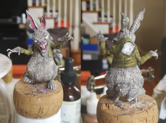
So onto the figures themselves.  The expressions on these two poor saps look like they are shouldering the unsung hero spot of any gremlin crew.  I'm going to make it clear they are trudging through the swampy mud to keep their allies going.

Pig feed doesn't look like green slop to me.  Wet yes - but it should be made of grains and oats and the like.  So I'm going for a "mash" look.  But it needs to be wet too.  Sounds kind of gross.  So a great reference would be the most disgusting school lunches in the world.  Done.  Reaper's Palomino Gold and Khaki Triad would work well but I'm going to sprinkle in some FolkArt equivalents.

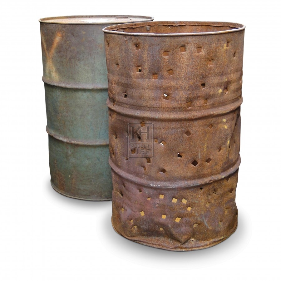
As to the second hauler (without the hat), he seems to be carrying an oil drum.  Where they got oil drums in Malifaux, who knows.  But let's make the most of it.  I wanted to avoid modern colors and thought this one in the background was closest to a Victorian color palette while still looking old.

Slop Hauler Color Scheme
  • Skin - Base: Reaper Fair Skin and Reaper Worn Olive, Shadow (Wash): Reaper Worn Olive, Highlights: Reaper Moldy Skin 
  • Shirt -  Base: Reaper Concrete Grey, Shadow (Wash): Reaper Moldy Skin, Highlights: Reaper Bloodless Skin
  • Gloves - Reaper Darker Greys
  • Buckets - Base: Ceramcoat Autumn Brown, Shadow (wash): Ceramcoat Cinnamon
  • Hat and Pants -  Base: Reaper Ashen Brown, Shadow (Wash): Ceramcoat Dark Forest Green 
  • Old Oil Drum - Base: Apple Barrel Wedgewood Green and Reaper Ashen Brown glaze, Highlights: Reaper Dusky Skin Highlight and Wedgewood, Reaper Ruddy Brown toward rims
  • Pig Slop -  Base: FolkArt Ochre Yellow Shadow (Wash): FolkArt Honeycomb wash, golden brown shadows, Wet Blend: pools of Folk Art Fawn, Reaper Tusk Ivory 
  • Leather -  Base: FolkArt English Mustard, Shadow (Wash): FolkArt Walnut Brown glaze
  • Suspenders -  Base: Reaper Military Grey
  • Muddy Bits  Shadow (Wash): Ceramcoat Autumn Brown
Being that these guys traipse through the mud weighed down with containers of swill, I didn't pin the mini down like I normally would. Instead I used my spackle (for mud), made the impressions of their feet into the base, solidified the spackle with some watered down white glue, and then super-glued them right on. 

Slop Hauler 1 didn't need a lot of green stuff.  I glued the one bucket to his elbow.  I didn't have the same options with the other one (which I would regret later).

When ever you have two hands that meet together, you are sure to run into a lot of gaps.  This was no exception as his left shoulder looked like it had been dislocated.  Serious scultping work and sanding.

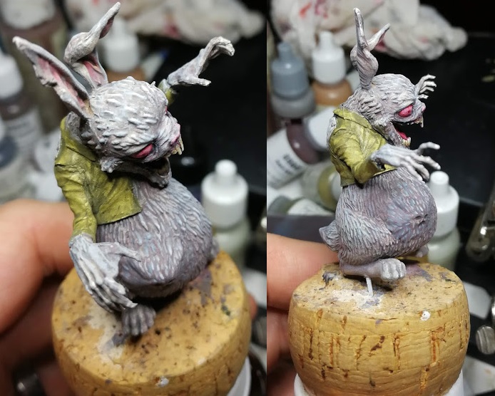
Priming used Army Painter's Uniform Grey, then black wash and drybrush white.  This is where craft paints normally work better for me - as the "dry part" usually easier to get.  But I got it too wet and got this mess.   Worse yet, the drybrushing sheared the other bucket right off the mini.  A lot of swearing this night.

Weird detail - on the right you can see this gremlin is not wearing a knit cap.  He's wearing a doo-rag as evidenced by the flap of material under his carrying stick.

Stoopid bucket.


Here on Slop Hauler 2 you can really see where the white drybrush should have been dryer.  Still - a little more black wash helps.  Not unfixable.


First coats on Slop Hauler 1...

...and his stoopid bucket.


In progress shot of #2 with the straps unpainted.

Slop Hauler one with washes completed.


Slop Hauler 2 with washes completed.


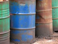
A few notes about the oil drum.  Considering the Malifaux setting is supposed to be late 1800's / early 1900's, a gremlin carrying on oil drum is a serious anachronism.  Why the sculptor didn't decide to use an actual wooden barrel...  

Anyway, color scheme... Black would blend in. Blue would clash. Thought green would be to similar to the skin tone... Until I found a good reference for a weathered oil drum.  Then I was in on it.


Past experience says once a thin plastic piece has snapped, it's just a matter of time before it breaks again, especially when you're manually moving it along a game board.  So I a made little hot glue strand to support the reattachment of the bucket.  Some tuft pieces will do it's job on hiding it.  But first...


... making the base look like wet, goopy mud.  I just added some Vallejo's liquid water to the base,  being careful not to get directly on the feet


A little heavy glaze of mud color (Ceramcoat Autumn Brown) on the feet and a tiny bit of mud spatter. Then hide that hot glue support with a tuft of grass.


While painting the figures while on the base saved me the aggravation of having to put pins in those tiny gremlin feet, my thumbs unfortunately wore away at the bases.


Thursday, March 14, 2019

Gnome Tinker: "I got just the thing..."

As a kid coming home from the movies, I would fantasize about my friends and I being in the starring roles.  But I puzzled over what role I had.  I was fast but there were better runners than me.  Not the strongest.  Not the smartest nor the most clever. 

But I was a big collector. When someone needed something, I always had a solution in my pockets.  That's probably what lead to my appreciation of engineering characters who can MacGyver a way out of the problem.  (Granted, I'm no engineer - but I still respect them like mad.)

My miniature hunting discovered a fantastic culprit from the very great Stonehaven Miniatures line: the Gnome Tinker. He looks perfect for that "I have one of those" abilities to pull something out on the fly.

One really important technical discovery on painting figures this small: washes don't work well on faces and small objects.  Wet blobs dominate the tiny crevices and everything just dries the color of the wash.

So I went with the grey primer / some very CAREFUL black liner / retouching grey areas / then white dry brush.

Most my color schemes don't have washes listed.  It's just way easier to paint up from darker colors - OR - just paint the shadow area directly and wet blend in.

Gnome Tinker Color Scheme
  • Face and Hands - Base: Reaper Tanned Highlight, Highlight: Lips color (below) thinned out
  • Lips - Base: Reaper Tanned Highlight and Reaper Rusty Red HD
  • Beard and Hair - Base: Reaper Woodland Brown HD, Highlight: Reaper Woodland Brown HD and Antique White
  • Teeth - Base: Reaper Moldy Skin and/or Antique White, Highlight: Reaper HD Concrete Grey and Reaper Dusky Skin Highlight
  • Pants - Base: FolkArt Teddy Bear Brown, Wash: FolkArt Walnut Brown 
  • Coat - Base: Reaper  Ashen Brown,  Highlight: Reaper Dusky Skin Highlight
  • Floppy Hat - Base: Reaper  Dusky Skin Highlight,  Highlight: Reaper HD Concrete Grey,  Hat Band: Reaper HD Ashen Brown
  • Leather Straps - Base: FolkArt English Mustard, Shadow (Wash): black/cinnamon
  • Twine - Reaper Moldy Skin & Bloodless Skin
  • Bags - FolkArt Butter Pecan
  • Drawers and Chests (red chest reference) - Cinnamon
  • Tentacles - Reaper Dusky Skin
  • Potion Bottle - Base: Reaper Ice Blue 
  • Plant Vase: FolkArt Aqua
  • Plant Stamen: Reaper HD Mossy Green and Field Green
  • Petals - Base: FolkArt Ochre Yellow, Highlights: Buttercup and Sunflower

Sometimes I forget to snap a pic of the primed figure.  This time I remembered after I finished the first coat of flesh on his face, hands, and ears.

It's not easy to tell from this rather blurry photo, but I actually got the eye under his hat painted.  Yes, that took the jewler's glasses and a some clean up.  But it's a fun accomplishment.


Almost done here.  After mounting the figure on a base, I realize the plant sitting atop the furniture was a bit of a blobby mess, lacking definition.  Challenge Accepted.

Just to show how small this guy is.... A double AA battery for size.

Some final pics... and thank God for my jewlers glasses to get those details right!


Thursday, February 28, 2019

Toothy Fairy: "They got my tooth!"


Bargain sales on sites like coolminiornot.com are the bane of all New Year's resolutions for me. I see a figure and my imagination runs wild on what I can do with them... and then that's it. I have to pick it up.

Hasslefree Miniatures Toothy Fairy is a great example. I'm pulled in by the unique and the unusual, and this one has that in spades. The tip-toe "shush" pose with one hand. The pair of pliers in the other. The lanky awkward frame. The wavy, wild hair. The ugly buckteeth of a wild hare. And those expressively odd eyes. This is a fey creature of a Neil Gaiman story, a dark fairy belonging to the Unseelie Court.

I liked it enough that I didn't get just one, I got two.  I had a creature in mind I wanted to use in a game, but they needed to fly.  So I also picked up Reaper's Fairy Wing pack.  Some major pinning was in order for these.

So I was surprised at how few pictures there are of this figure. The only one I found was on coolminiornot. The artist's approach there was for a sad and haunted looking creature whereas I wanted to emphasize the otherworldly look I got.

Tricky thing about her is she needs to be assembled and her arms are tiny tiny tiny.

I cut her off the tab with a pair of clippers. Surprisingly I was able to get a pin in the foot without going through the foot (which sadly I do at times).

Assembly requires green stuff. Can't avoid it with those tiny gaps around the arms.

So for the cool figure, I went with a white primer.  On the warm figure I chose a grey primer / black wash / white drybrush.  (End results have proven that I probably should have swapped them.)  Here's a quick snap of the warm figure before the white drybrush.


I decided that one figure should go for a warm tone, the other a cool tone.  I dabbled around a bit on the palette before deciding.

For the cool tone - FolkArt Aqua and transitioned into Anita's Light Green.
For the warm tone - Apple Barrel Burgundy into FolkArt Autumn Leaves into Reaper HD Rusty Red


Cool tone fairy with feather wings in the "Just one minute, I have to yank this kid's tooth out" pose

Warm tone fairy with butterfly wings in the shush pose

These pics were just a comparison of color matching.  Assembling them they looked good. But attaching to the base, they did flop over a bit.  Especially the butterfly wings which we so heavy for the pinning I was doing.


Thursday, January 31, 2019

Coryphee: A Flourish and Knife-shoes

In terms of style and character, I'm going on record to say that the coryphee are unique to Malifaux.

A coryphée normally refers to a rank in ballet. The rank-and-file ballerinas are the "corps de ballet", and the coryphée serves as their lieutenant -- the lead dancer of the corps, but below the other dancers.

But of course, this a wargame. So even dancing becomes violent.  In the game, Malifaux's coryphee (sans acute accent) keeps the dancer garb but are embellished with blades on the hands and feet.  They have an ability to move into an opponent's space to attack and move out without getting hit in turn.

So you have a nimble dancer adorned in taffeta with scissorhands who deftly tumbles in to cut you to ribbons and then tumbles out in time with the music.

Further, they're man-sized puppets, not people... because it helps to be a mannequin if you're going to dance around in knife-shoes.

So... graceful bladed ballet-lieutenant puppets.  Can't think of where I've seen that elsewhere.

Onto painting them.  I've played these only with basic priming done in a game or two. I found it was really difficult to figure from the card which one was half kneeling down (aka Coryphee 1) and which one was re-enacting the crane kick in Karate Kid (aka Coryphee 2).  So lesson learned?  Paint them the same color as the cards (i.e., same color as the box).  I don't often follow the canned color pattern, but experience showed the way to wisdom here.

General Color on both
  • "Skin" Fabric - Base: FolkArt Butter Pecan, Wash: Vallejo Sepia Ink, Highlight 1: FolkArt Linen
  • Boots - Base: heavy glaze of black, Highlight 1: FolkArt Metallic Black to finish (to give a shiny leather look).
  • Blades - Vallejo NMM Grey Metallic set

Coryphee 1 - Color pallet Pink

  • Corset and gloves - Reaper Gem Purple
  • Bows on Corset - Base: Reaper Entrail Pink, Wash: Brilliant Red, Highlight: Entrail Pink and Apple Barrel Antique White (also see final touch notes below using FolkArt Metallic White)
  • Dress - Base: Reaper Entrail Pink, Wash: Reaper Crimson Red, Off Shadow: Brilliant Red, Highlight: Entrail Pink and Apple Barrel Antique White
  • Bows on dress - Base: Reaper Gem Purple
  • Undergarment - Reaper Moldy Skin and Bloodless Skin


Coryphee 2 - Color pallet Turquoise

  • Corset - Base: Reaper Ghoul Skin, Main Shadow: Reaper HD Field Grey, Lines: Bloodless Skin
  • Dress and Bow - Base: FolkArt Aqua, Shadow 1: Reaper HD Turquoise, Deeper Shadow: Reaper HD Winter Blue, Highlight: Reaper HD Ice Blue and Apple Barrel Antique White
  • UndergarmentBase: Reaper Moldy Skin


Quick shot of what Coryphee 1 looked like after Grey prime, black wash, white drybrush while I worked on the "skin" fabric


Coryphee 2. Initial work.  Stripes on the corset worked out well.  And I was also pleased with the undershadow colors on the back of the dress.


Here's Coryphee1 mounted on base. The Malifaxu 2e figures have an annoying recurrance with great figures but impossible to stay mounted on the base due to the size of figure's foot print.


Size comparison with AA batteries to show perspective to the problem.

Anyway, at this point I felt the bow had no "pop".  Visually, it just got confused with the rest of the dress. So I decided to mix my 2 Highlight colors with some FolkArt Metallic White and just lightly go around all of its edges. 

The base was looking a little lonely - mostly because it was off-center.  So I crafted a little ribbon laying on the floor out of green stuff, as if the coryphee had just swung a scissorhand to cut a ribbon. Used the same blue dress color as above.


Now presenting the graceful bladed ballet-lieutenant puppets...


Thursday, January 17, 2019

Luther the Pascha Hare 2: From Uneven to Uneasy

So! With introspection and construction out of the way, onto Luther's color scheme.


  • Fur - Undertone Base: FolkArt Barn Wood, Shadow (Wash): Reaper Stormy Grey, Main Base: Heavy Glaze of Reaper HD Ashen Brown, Highlights: Reaper Concrete Grey, then Reaper Misty Grey
  • Jacket -  Shadow (Wash): Reaper Olive Shadow, Main Base: Reaper Worn Olive, Highlight: Reaper Moldy Skin
  • Eyes - Base: Reaper HD Brilliant Red, Shadow (Wash): Reaper HD Rusty Red
  • Inner Ears - Base: Reaper HD Entrail Pink, Shadow (Wash): FolkArt Barn Wood (select areas) 
  • Denim Patch - Base: Ceramacoat Denim Blue, Shadow (Wash): Reaper CCC, Highlight: Reaper HD Military Grey

Re-primed.  The bulge stands out from the fur a bit but I knew a good paint job would help cover up the differences.

Some first coats.  It's funny how the pink in the ear dominates at this stage. Washes and highlights focused on grey tones (not reds) will tamp that down a bit. 

First washes made him look really dirty.

The heavy glaze of ashen brown moves him away from a dirty looking creature to a more rich fur color.  Though at this point the face bulge is clearly standing out from the fur on the figure.

The contrast between the grey-ashen-brown and the concrete grey provided a nice contrast I wasn't expecting.  The concrete grey has a little blue in it.  And normally I avoid mixing a warm and cool tone, but it really helped make this bulge work.

Some final fur highlights and eye work.

Went with a straight denim color for the patch on the back.

There's a some lessons learned on the figure that I would do better if I did him again - mostly green stuff lessons. But the end result fits right in that uneasy place I'd hoped he'd be.

He's freaky enough that I could see him frightening little kids out of a closet door...


Thursday, January 3, 2019

Luther the Pascha Hare 1: The Uncanny Valley Between Comedy and Horror

In college, my American Literature professor taught me that humor was based on "a subject losing his/her pride" in the moment's resolution.  I internalized that theory for many years, thinking humor had the ability to save humanity from its own collective ego.  What I didn't know was this was only the second of three modern theories of humor.  What I knew was the superiority theory.  The other two being relief theory and incongruous juxtaposition theory.

I want to focus on Incongruous Juxtaposition, or as I like to call it: the sudden moment you realized that you perceived the now absurd situation very wrong.

If I had known about the last theory - all my papers in college would have centered around it.  I relate to it like it was a family member.  As I've gotten older, I see modern humor has taken the comedic juxtapositions to more and more absurd extremes, to the point where surreal humor are just older memes now.  Charlie the Unicorn.  It's humor for a world where resolutions comes from places so unexpected, it's bizarre.  Almost anything on adult swim qualifies, but the obvious example is Aqua Teen Hunger Force.

But I've also noticed how the "bizarre unexpected" can quickly swing in the wrong direction. For example, Chad Feldheimer (Brad Pitt) hiding in the closet of Harry Pfarrer (George Clooney) in the Cohen Brother's Burn After Reading.  The set-up feels like a wind-up to a slapstick scene complete with Chad's goofy look when the closet opens.  But any initial laughs are cut short by the sudden violence. Then Harry's concerns over Chad being "a spook" brings back a very nervous humor.  The audience is stuck between laughter and jump-scare fear.

A bizarre resolution can cause a reaction that doesn't make you laugh and teeters on the uncomfortable.  Seeing Pulp Fiction in the theater, I remembered some people laughing when the Gimp came out, while others started to close their eyes and cringe in their seats. There's a great video on the "creeps" by vsauce, that talks about that reaction when we approach the valley between certainty and ambiguity.

It leads me to think there's grey area between comedy and horror: the sudden moment you realize the absurd situation can go two different ways (or in the Coen Brothers case, both at once). Personally I find a use for both.  If humor can teach you to laugh at yourself, horror can prepare you to be unafraid of the unexpected.

I guess this is why I gravitate towards monsters that are more unnerving than obviously dangerous.  Sure, I hold a handful of classic tropes that frightened me as a kid (e.g., werewolves, body snatchers).  But the warped ones that sit on that cusp of "ambiguity" speak to me more.

Which brings me to Luther the Pascha Hare.  He first appeared in Wyrd Chronicles 17 in a short story that was ridiculous, unsettling, and fun.  But it was the cover that grabbed me in the same way that the original Teddy figure grabbed me: a childish figure warped into an absurd terror.  It's frightening but not in a realistic way - like disease, violence or sudden change. He's stuck in between a cartoon and a threat.

The subjectively "fun" part of the story was reading that Luther swallowed people whole, and seeing the handprints pushing from inside his belly on the cover art.  That gave me an idea for his figure...

So on the sculpt... I love the face and the pose, but there's two features that bug me.  First, Luther is wearing a top hat. It's not the character on that front cover.  The second is "the swallowed" inside Luther's belly.  You can see Luther's stomach is angular like something is bumping around inside, but you can't see a face or hands pressing outwards - probably due to the fur detail.  This is probably a compromise the sculptor had to make: the figure needs to visibly have fur but sculpting fur will obscure any impression "the swallowed" makes.

Malifaux made some inserts based on different terrains. One was an orphanage... but clearly a very haunted orphanage. One of them was a ghost coming out of a rug.  I'd already made a copy of this with Instant Mold and green stuff. I could cut out the face and hand pressing up from the rug.


My first run on applying the face of "the swallowed".  I was not going to re-sculpt fur over the face for fear of running into the same conundrum the sculptor probably ran into.  Painting some fur on would be much easier than sculpting it.

Ugh!!  The hat had to go!  The more I looked at it, the more I hated it. Too much comedy, not enough creepy.

Malifaux 2nd edition is known for it's confounding assembly schemes, where tiny important model bits can be mistaken on the sprue for flash to ignore.  So Luther is unusual in that he arrives assembled.  With the hat off I could see why they made this decision.  It looks like the pieces didn't quite line up as smoothly as other builds, and all the gaps culminated in the head piece.

Speaking of gaps, more green stuff was needed on other areas.  I was starting to worry about my face.  It was bulging out so far from the stomach that it was going to need a lot of green stuff to fill gaps and make the folds in the stretched skin look natural.


Sculpting some the scalp and adding a little fur in.

I kept adding green stuff on to make my initial bit of face bulge work.  But eventually I had to admit it wasn't working.  The piece was too thick and to make it work would mean adding so much green stuff it would take over the figure. So I made the decision to take it off and start over.  This time with a thinner piece.  It worked out much better, though sadly some leftover green stuff was stuck on the figure.

This is the only pic I took where I tried to integrate the hand pressing out.  I eventually took it off as I couldn't make the creases and fold look natural so close next to the face bulge. The end result was that area looked a touch rough from left over green stuff residue.

More on the second post...