So my amazing family got me a slew of amazing miniatures I really wanted for Xmas. Then we promptly packed up and jumped on a plane to Florida for the rest of the holiday week - so I could do absolutely nothing about it. But it was a well-needed break, and you really cannot complain about winter in Florida. Plus, I did manage to kick back and get inspired.
One of the best parts of doing anything creative - be it lyrics, music, poems, sculpture, game design, painting, whatever - is that you can pull your inspiration from anywhere. And anywhere you go, you look at things in more than one way: you have it as the experience (which everyone has), and you have it as a source of inspiration - a little idea factory. You have the moment and are thinking of ways of recapturing the moment - or at least a bit of it.
So seeing trees with Spanish moss is probably commonplace for anyone living in Florida but it was fascinating to me. It seemed like every tree on the highway that wasn't a palm was swamp background.

Probably my favorite part (Painting reference-wise, anyway) was a stop at the St. Petersburg Dali Museum. I caught a couple snaps (no flash, mind you) of bits that just made me stop and gawk.

Still Life (Fish with Red Bowl) is one of his earlier works but a couple things grabbed me.

After days of trying to get a plate to look right, it was an interesting study to see how a master got a shiny reflection in a bowl.

But that's nothing compared to the details on the fish scales. I love how he got them to shine. Just incredible.

Portrait of my Dead Brother had multiple themes and styles going at once: a portrait, a pixel / stipple art effect, a hidden crow, soldiers and cherries. There were dark and light cherries throughout the work; most looked like the ones at the bottom. But the 3-4 in the middle of this snap almost looked like they were in three dimensions. The slightly lighter outer ring made seemed to be the key effect.
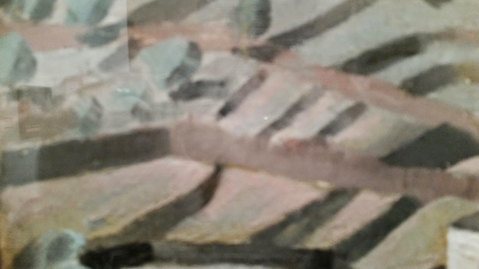
Landscapes from one of Dali earlier works... what caught me was what looked like multiple colors on the land. But when I zoomed in on it, it really was just two colors. Mostly a reddish brown clay color and a deep green Christmas wreath type green glaze. Two colors I wouldn't have put together.

When you stand back like this the land looks natural. Close up, I just wouldn't have put the two together.

Another lesser known painting which I don't know the name to (Angel or St. Someone at Lake Something-or-other). But I loved how the angel sort of just blends into the lake with a slight black (sometimes white) outline.

The only color bit in "Sentimental Colloquy". What got me about this, other than the symbology of the piano and art, was the color of the water: it's simultaneously a rainbow palette and splashing - yet still obviously water.


"Still Life in Motion". There is nothing to point out here other than the obvious: perfect technique.
No comments:
Post a Comment