Sunday, May 24, 2015

Terraclips: Dead yet still alive

I started using Terraclips Building and Street sets for a city campaign I was running.  I grew attached to them for their flexibilty and low impact on storage. In fact, they sort of helped me make the jump into playing Malifaux. 

I always wanted to get more of the Street set but kept putting off until finances got a little better. I noticed last Xmas the the Wyrd site was clearing them out. Didn't think much of it.  I had them on my Amazon wish list. Then this year, when I wasn't looking, they became unavailable online.  I blinked and the whole line was dropped.  I freaked out, ran to my local FLGS and bought out what was there. 

A bit of a shame. The design was extremely versatile. It was perfect for a tabletop RPG.  Being able to put miniatures in a house where you could pull out a wall, or have some on one level while others on another made the abstract much more real. 

For wargaming, it was pretty good.  The big caveot I found was the thing that made Terraclips great for RPG's - multiple level buildings where you could take the roof off and resolve a separate fight from the main group - could slow down a Malifaux game. To get a miniature to the top level of a building could take an entire session. The best way to make it work was two have a two level platform or bridge, but little-to-no interior interactions.  

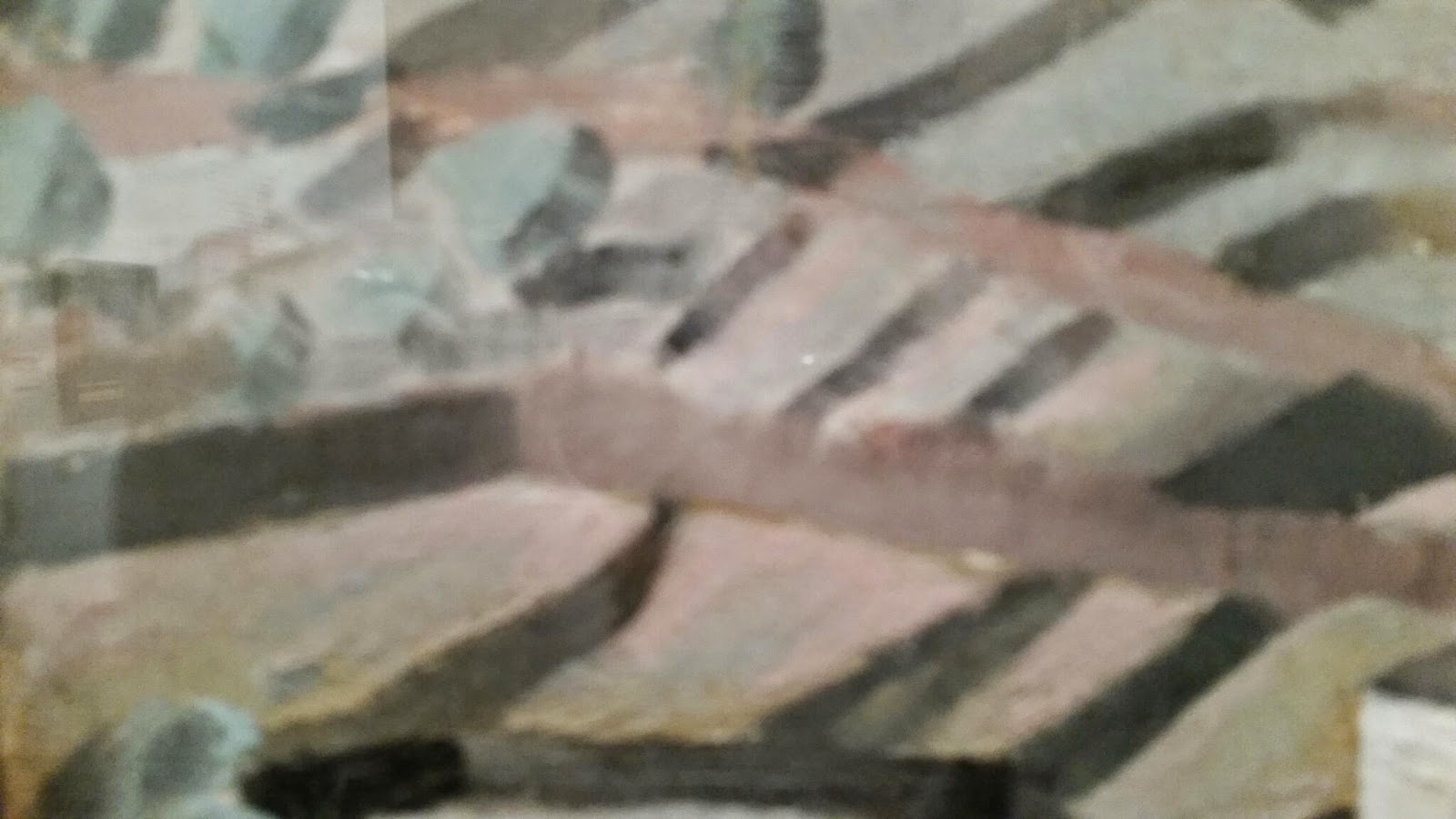
Here's an example of Terraclips in a Malifux game that I thought worked.  The idea was two buildings with second floor platform and railing you could run through the house to get to... or run between two houses or up a bridge / staircase to get from one side to the other. Here I used the two ramps to have a fountain in the middle. Note: the board doesn't include the 6" deployment zone.


The middle could be swapped out for something else. Here I used more an elevated walkway.  It worked out well, as long as you clarified you could not run underneath the platforms.


Here's one last set-up with the middle clear and ladders where the platforms used to be.


I'll do a post soon where I show how well it worked for RPG's.

Tuesday, May 12, 2015

MCFA Show 2015

Haven't posted in a while. Have been painting - just not anything I've been proud enough to post.  :-(
I DID however attend the Miniature Figure Collectors of America show in Philly today  to get quick peek at some of the entries.
Mainly what l wanted to see was... if I took a picture with this camera-phone, would I get a picture that looked like the pics on coolminiornot, wyrd or reapermini... or would they look as unfinished as mine.
The answers I found:
1) most historical minis are at a much larger scale than I paint. So there's a lot more detail there
2) the halogen lights of the convention center worked for some quick but well-lit shots.  My house is always unnaturally dark
3) the details are a lot better than mine but I bet I could eventually get as good as some of the guys there. It just a matter of add pending several hours on that last coat of whitish sheen.
Some of the pro's though... jeez, they we're crazy good.
Mostly I took pics of the 28 mm size I'm used to painting as opposed to the 54 mm historical scale.   
A Malifaux mini! Jim Richey did a nice job on this one.

Wish I grabbed this painter's name.  Really impressive purple skin tone work.

I had to grab a snap of this Reaper Pathfinder mini just because one of my fellow party members is using it in our current campaign for his paladin.

This one is about 54 mm scale.  But zoom in on the detail on that robe.  It's incredible.

Tuesday, January 20, 2015

The Carver, Part 1

So I'm going to blog a bit about scarecrows because I have a lot of them on my hands.  Specifically:
I'm starting with The Carver though, because I wanted to knock out the ones that need to be assembled first (. ..and plus I wanted to try Night of the Carver scenario for a game).

He came in a single plastic sleeve where you had to cut him off sprues.  
What threw me off a bit was he came with two heads: a pumpkin head, and a cloth one that looked frighteningly like The Scarecrow from the Chris Nolan Batman series.

I loved both so checked in with the family. My wife in particular insisted on a gourd was way better. So Peter Pumpkinhead it is.  Clothface is just going to have wait for a kitbash.


What's most interesting to me about the mini is this subtle detail of how he's still attached to the pole he was hung on. Its like he got he got his hands free from the pole, but not his upper body.  So he forced himself off by breaking the base.  Now he's free to walk but still stuck with a scarecrow cross on his back.

This time to prime I decided on combining the Black prime/white dry brush and White prime / black wash techniques. I did a Grey Prime, black wash, and drybrush white.  I was stunned at how well it came out.

I used this same priming method for a Janey Blankenship from Reaper that I planned on using as a proxy for a Pistolero de Latigo.  I was stunned at how well it came out.  Its almost as if I tried my hand at monochrome for the first time.

Wednesday, December 31, 2014

Teddy 6: Re-pinning and calling it a day

I looked further into why Teddy would not stand flat.  It was partially due to that Wyrd gave him rounded feet underneath.  That meant he stood more like a Weeble... but one who did fall down.

After re-touching up the dings and slips from the previous session with Teddy, I figured I could make it work by making it look just floating slightly above the pentagram, like he'd just been summoned.  A few shadows around the feet and blackening out the dried green stuff is what I'd need. But...


...I kept picking him up to see what brush would fit in under the insert.  One time I put him down and he just popped out of his pins.  And of course, a little paint came off with him.

Okay so I had clean-up painting and re-pinning work to do. But this time, I was going to make sure Teddy was going to stay in place.  He's a top-heavy mini.  Short-cutting with smaller pins didn't work.  Longer pins were needed. Abondon the floating look - get him as flat to the ground as possible. 

So time to route out the tabs underneath the base.  Say good-bye plastic tabs!  You're a nice idea, but just in the way...


The other thing that had to happen was filing down the excess metal from under the footpads.

This time, Teddy slid in place pretty nicely.

Bent the pins back, glued in place and added some washers to give that extra weight to the bottom.  Also I left one washer a little bumped underneath.  This way I could pick him up from the base during gameplay - without having to put my fingers all over Teddy himself.


Teddy finally looked good. A small voice in my head said, "You know what would really look good? A little bit of drool dripping out of his mouth, like he'd just been conjured up and is just salivating over sinking his teeth into you." And another voice answered, "YOU'RE DONE. Let it go, son."

So I'm calling Teddy done.

A few lessons learned:
  • The original Teddy mini has rounded feet. So once he's cut off the metal tab, there's filing that needs to be done
  • Always pin your minis first. I hesitated because of the weight.  Big mistake.
  • Never drill holes on a prefab inserts before they've been glued 
  • And if you've got a heavy mini where you're going to twist the pins under the base, file out the plastic tabs underneath the base before finalizing
  • White primer, black wash. Perfect combo for lighters colors that "pop"

Teddy 5: Pinning and other nuisances

I'd pickend up some Tamiya Clear Red as I'd read that was the best way to get some gory blood reds... And I really liked the effect that Klatu.org got on his Teddy.   But after going through all this work to get the badge, teeth, and lips right - dumping another set of colors overtop of what I've done made me very nervous.  If it didn't go on right, there was no way for me to fix it with out starting from scratch.

I threw some on some test skeletons (from Reaper's first Bones set), and was not thrilled with the results. Examples I've read from other painters had all these shades that fresh blood has.  Whereas what I did just looked like... paint.  I obviously needed more time to experiment with this style.

I ran the idea past my family. They convinced me that blood coming out of Teddy's mouth was too over the top.  Given my hesitancy, it wasn't hard to convince me.

That meant it was pinning time!  I hadn't yet glued the insert to the base, but I wanted to make sure the holes were in the right spots. So I pre-drilled some holes in the orphanage base and simultaneously the base itself.  (I would later come to regret doing this.) 

I also shaved some more metal off the pads of Teddy's feet to get him to stand flatter, and headed over to my buddy's house for a night of painting. I figured I'd knock the gluing and pinning process in an hour or less and get to finishing my Stitched Together models.

Upon arriving, I picked up my painting bag, it slipped and I cut open my forefinger with my thumbnail. (I still am unclear how I pulled this accident off.) I started getting real blood on the pentagram that was conjuring Teddy.  A little foreboding...


The gluing process didn't go smooth.  I struggled to get the holes in the base lined up with the orphanage insert before the glue dried.  I eventually used a rubber cement which gave me a little time to do the lining up.  When I finally got that I put Teddy in and tried using extra long pins and bending underneath the base to give the mini more stability.  (NOTE: I got this idea from the very informative HobbyGuy / MiniGirl #36 blog, though it looks like this episode has been taken down.)

But I didn't route out the plastic lips under the base like I normally do when I put my washers underneath. So I couldn't get a clear 45° angle to bend the pins. I ended up putting more elbow grease in and pulled the pins put of Teddy completely. And I scratched the paint off some of the boards. And more blood got on the summoning stone.

So I had to pull the pins out, recut them, and superglue them back into Ted.  This also meant that using green epoxy for extra stability was unavoidable at this point. It would be needed just where the pin was coming out of Teddy and under the base.  The end result was Teddy's feet would not hit the floor flatly. He's sort of levitating there above the summoning stone.  At this point, I called it a night.

Sunday, December 28, 2014

Xmas Break: Trip to Dali Museum

So my amazing family got me a slew of amazing miniatures I really wanted for Xmas. Then we promptly packed up and jumped on a plane to Florida for the rest of the holiday week - so I could do absolutely nothing about it.  But it was a well-needed break, and you really cannot complain about winter in Florida. Plus, I did manage to kick back and get inspired.

One of the best parts of doing anything creative - be it lyrics, music, poems, sculpture, game design, painting, whatever - is that you can pull your inspiration from anywhere. And anywhere you go, you look at things in more than one way: you have it as the experience (which everyone has), and you have it as a source of inspiration - a little idea factory. You have the moment and are thinking of ways of recapturing the moment - or at least a bit of it.

So seeing trees with Spanish moss is probably commonplace for anyone living in Florida but it was fascinating to me. It seemed like every tree on the highway that wasn't a palm was swamp background. 

Probably my favorite part (Painting reference-wise, anyway) was a stop at the St. Petersburg Dali Museum.  I caught a couple snaps (no flash, mind you) of bits that just made me stop and gawk.


Still Life (Fish with Red Bowl) is one of his earlier works but a couple things grabbed me.
After days of trying to get a plate to look right, it was an interesting study to see how a master got a shiny reflection in a bowl.

But that's nothing compared to the details on the fish scales.  I love how he got them to shine. Just incredible.

Portrait of my Dead Brother had multiple themes and styles going at once: a portrait, a pixel / stipple art effect, a hidden crow, soldiers and cherries.  There were dark and light cherries throughout the work; most looked like the ones at the bottom. But the 3-4 in the middle of this snap almost looked like they were in three dimensions. The slightly lighter outer ring made seemed to be the key effect.

 Landscapes from one of Dali earlier works... what caught me was what looked like multiple colors on the land.  But when I zoomed in on it, it really was just two colors.  Mostly a reddish brown clay color and a deep green Christmas wreath type green glaze.  Two colors I wouldn't have put together.

When you stand back like this the land looks natural.  Close up, I just wouldn't have put the two together.

Another lesser known painting which I don't know the name to (Angel or St. Someone at Lake Something-or-other).  But I loved how the angel sort of just blends into the lake with a slight black  (sometimes white) outline.

The only color bit in "Sentimental Colloquy".  What got me about this, other than the symbology of the piano and art, was the color of the water: it's simultaneously a rainbow palette and splashing - yet still obviously water.

"Still Life in Motion".  There is nothing to point out here other than the obvious: perfect technique.

Wednesday, December 24, 2014

Teddy 4: First Wash, Detail Clean-up and Badge of Frustration

Almost every miniature I paint has one spot that becomes the bane of my existence.  This miniature's bane will be the "t" and "e" in the word plate.

So I did a brown wash of FolkArt Teddy Bear Brown on key spots.  Did a little Coffee Bean and Van Dyke Brown to get some separation.  Also added this to the claws a little too to give it a more bone look. 

Also decided it was time to get Teddy on some pins before I started doing the detailed work.  I didn't want to do this earlier as Teddy is a heavy mini and needed as much support as possible.  But I couldn't delay it forever.  Otherwise I'd be putting my hands all over key details I might not be able to recreate. This part went smoothly.

Next up - make the plate look a little more like a plate rather than two concentric circles with a face.  I could have gone for the "admiral dinner plate" look. But I decided on a more classic plate reference.  Reaper's Power Palate tool is a god send. I've learned a lot about shading and tones in ways I never could see on my own.

Reaper's suggestion was their Ghost White on one side, Leather White on the other with Pure White for the highligts.  I used an icy blue, FolkArt Dove Grey and Folk Art Titanium White.  I also didn't get rid of the middle blue ring. Since I used glazes, it's there very subtly.  It's still a little too blue for my tastes though.

I gave the outer ring a thin line of pure black for separation.  That's where the trouble started.  The letters started getting in the way a little.  And the "T" in plate was just weird looking.  The cross was too slanted.  And the "E" was missing some definition.

So I fixed it... with the wrong font color.  I used a darker brown (Coffee Bean) by accident.  I forgot I had the font in the same color as the wash on the fur (Teddy Bear Brown).  So I glazed the "E" with a little white to fix it.  Then I trimmed back the cross in "T".  But it was on top of the "E".  So I whited out portions of the and redrew, but now the spacing is all off.
At some point, you have to realize you are your own worst enemy. So I stepped away to eat something and came back to fixing the font. A little TB Brown to fix the cross in the "T"... A little white between the "U" and "B"... And I felt it was a lot better.

Left Teddy for the day to experiment on blood a little (more on that later). Came back next day to tighten a few other details, namely:
  • Glaze of FolkArt Dove White to get more white plate than blue plate
  • Some more dark wash around the eyes to make the crazy pop more
  • Some yellowish color at the base of each tooth so they look more realistic (FolkArt Cappuccino)